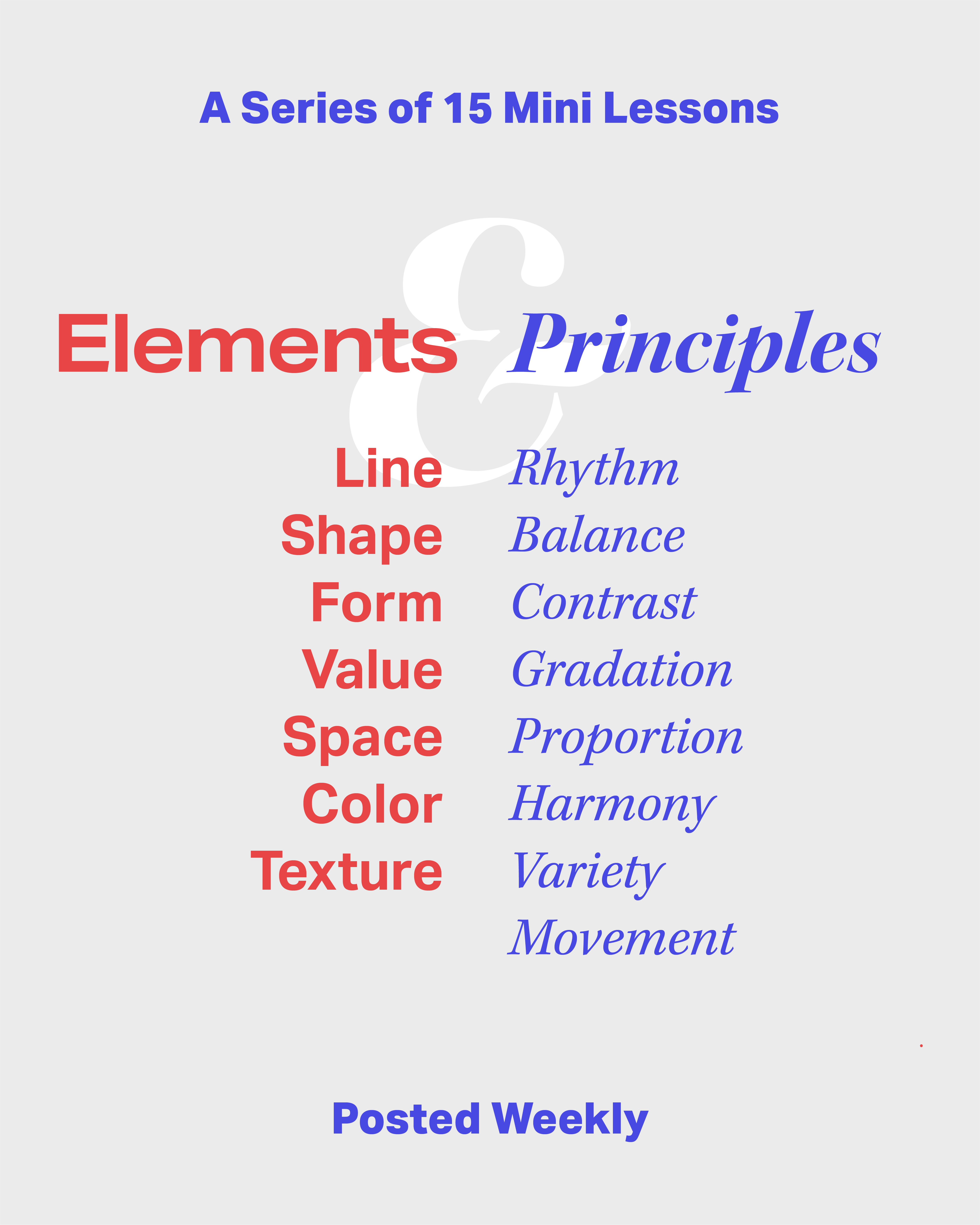
Elements & Principles of Design
Made in collaboration with Caleb Morningstar, this is an instagram series made to teach youth across Iowa about the elements and principles of design. In order to remain approacable to youth we decided to take it back to the basics. We stuck with primary colors and used a crayon-like brush for the illustration. The result is a fun, yet informative series.
INTRODUCTION POST
This is the first post of the series just introducing the next fifteen informational posts.
All the of the images below are image gallaries.
Hover over the image to click through.
MINI LESSON 1
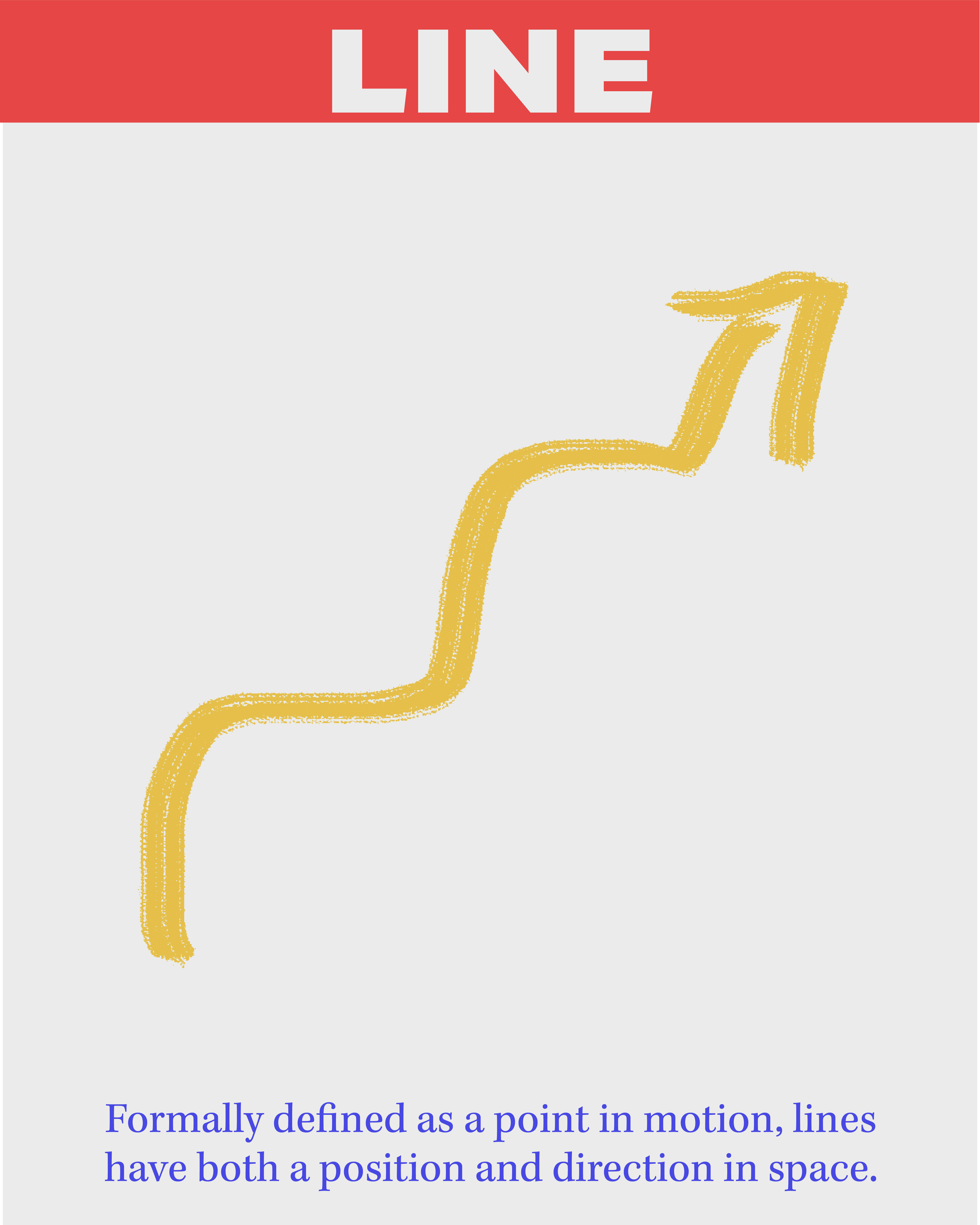
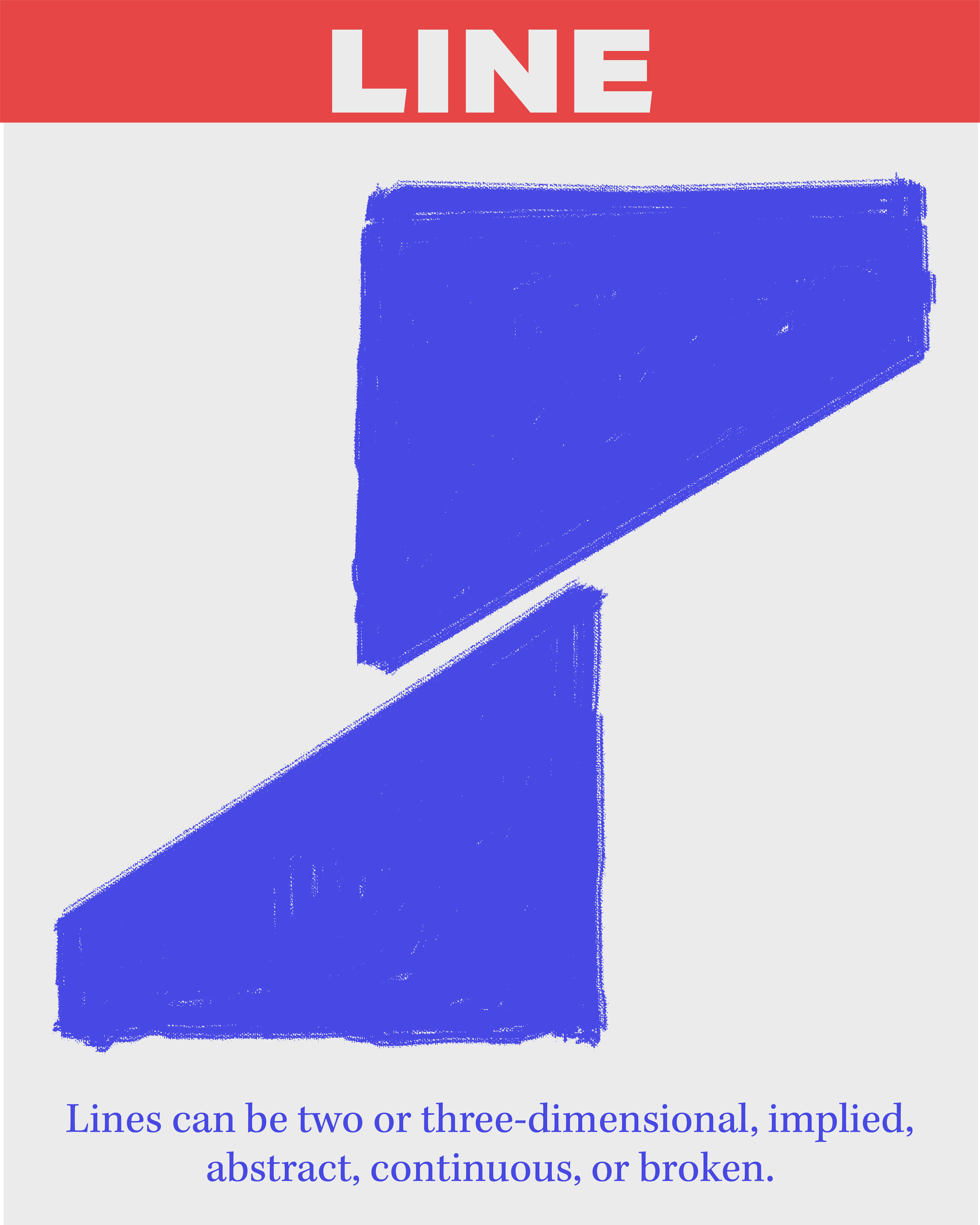
Element – Line
Formally defined as a point in motion, lines have both a position and direction in space.
Lines can be two or three-dimentional, implied, abstract, continuous or broken.
Implied lines are often used by photographers to direct the viewers eye around the composition.
MINI LESSON 2
Element – Shape
A shape is a perceivable area and is defined by its bondaries, whatever they may be made of.
Shapes exist in only two dimentions: height and width. Shapes have no physical depth.
Maps use shapes to represent complex, three-dimentional areas on a flat page.
MINI LESSON 3
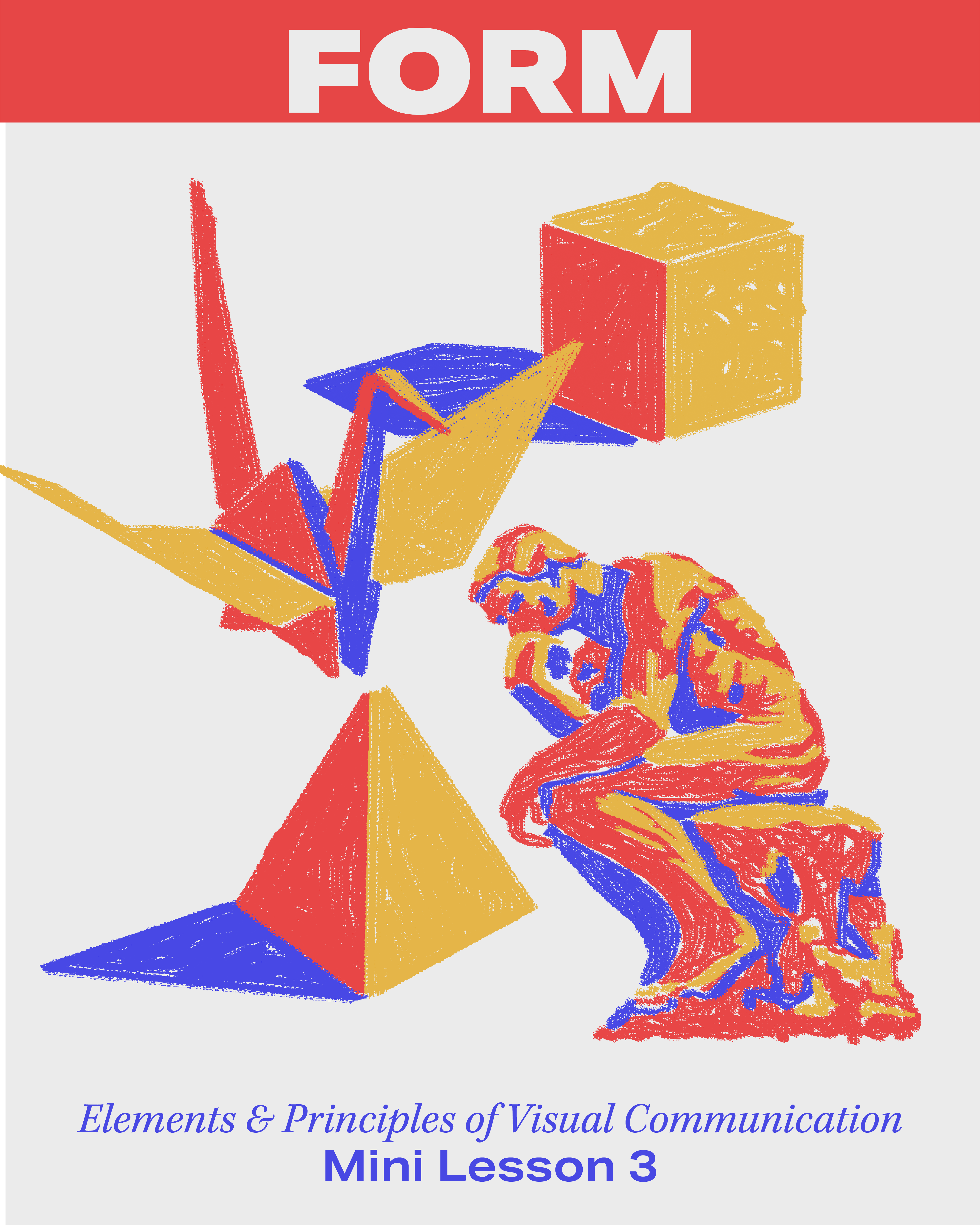
Element – Form
A form is a percieveable object that is three-dimentional in nature.
A form can be created or suggested by geomentric shapes or organic components.
Sculpture is one of the purest expressions of the power and beauty of form.
MINI LESSON 4
Element – Value
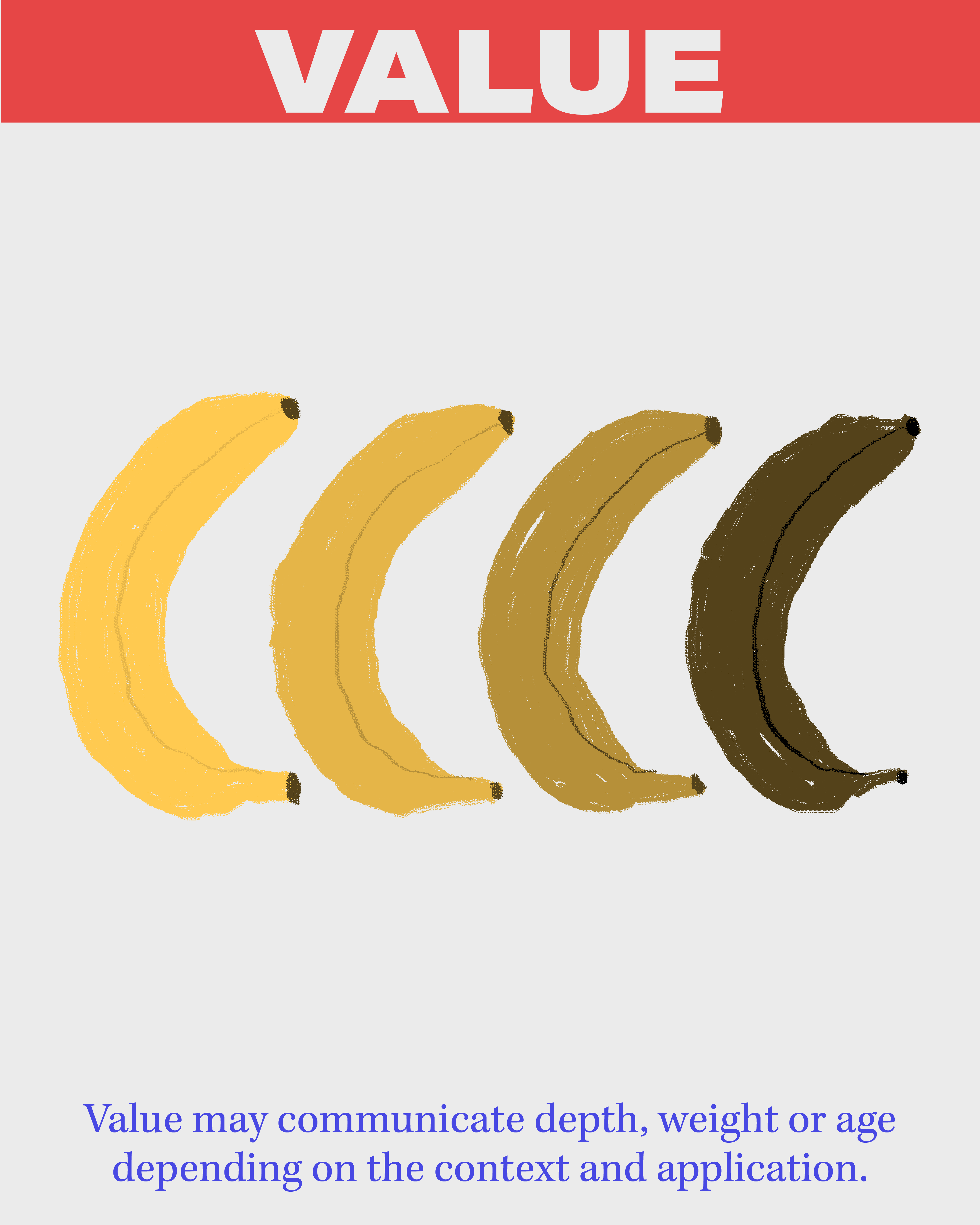
Value is used to describe the relative lightness or darkness of an area.
Value may communicate depth, weight or age depending on the context and application.
Value can be a predictor of water content in clouds. the darker the value, the more water.
MINI LESSON 5
Element – Space
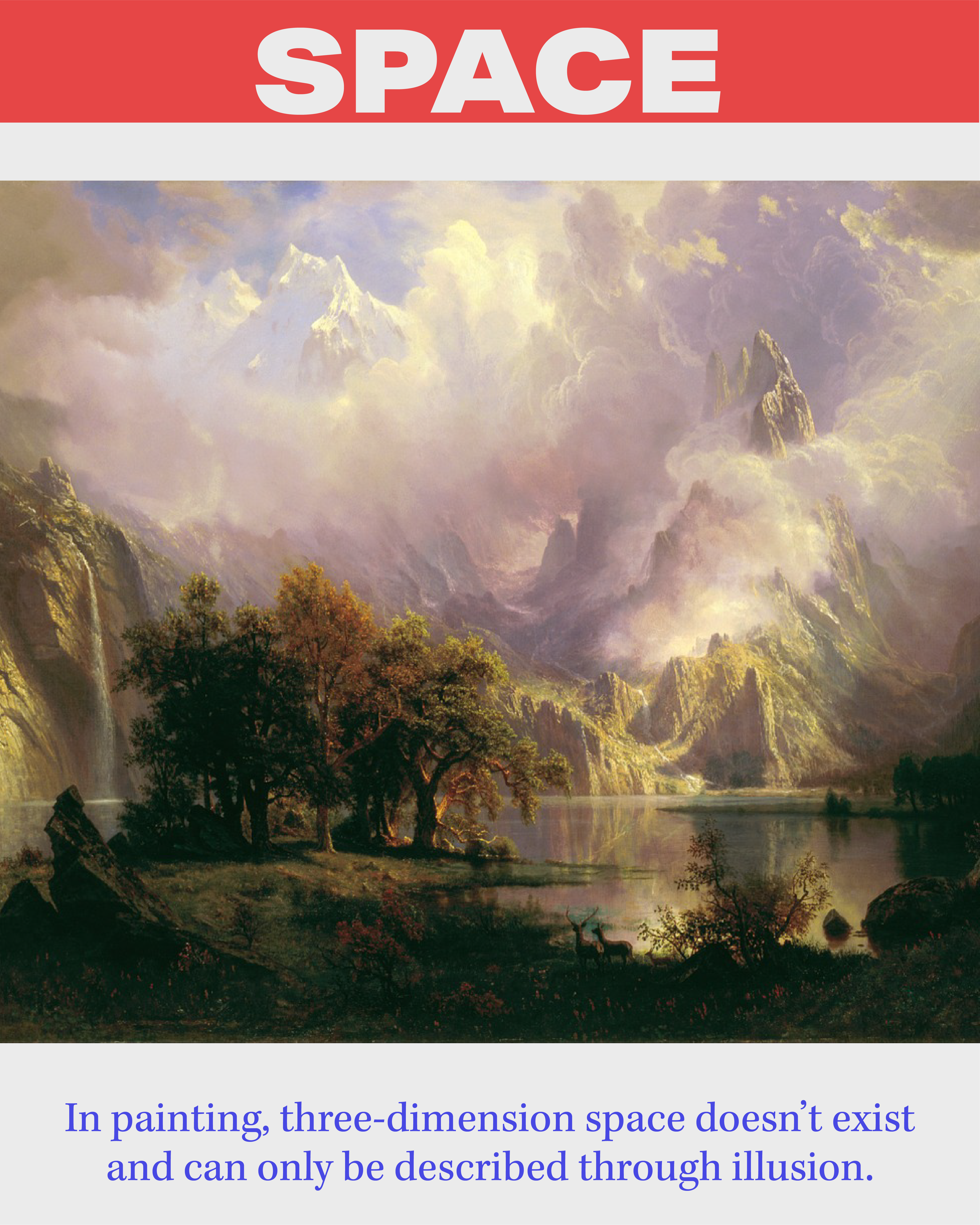
Space is the boundless expance in which objects can exist and can be flat or three-dimentional.
Space may also refer to the area between, within, or surrounding an object or objects.
In painting, three-dimentional space doesn’t exist and can only be described through illusion.
MINI LESSON 6
Element – Color
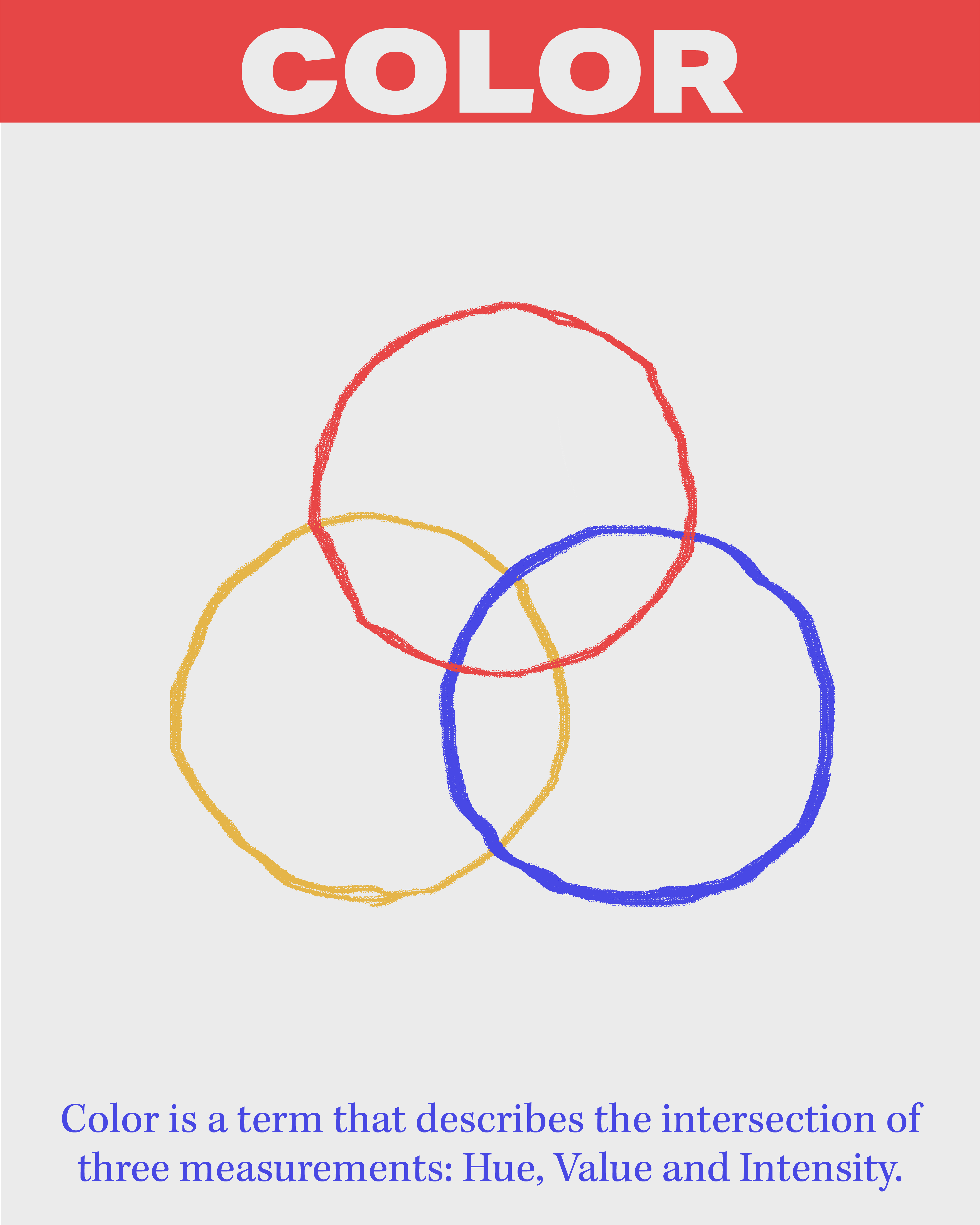
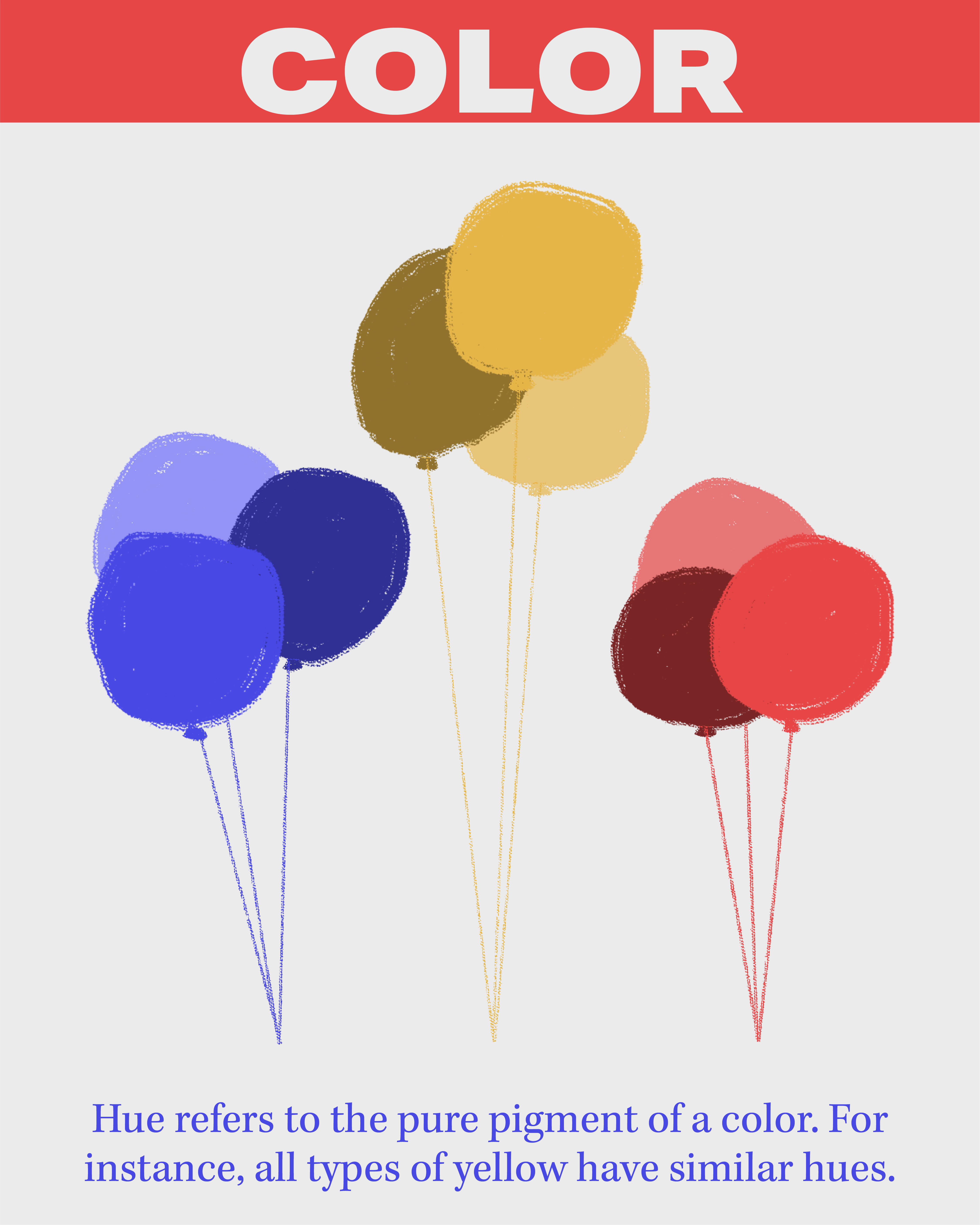
Color is a term that describes the intersection of three measurements: Hue, Value and Intensity.
Hue refers to the pure pigment of a color. For instance all types of yellow have similar hues.
Value, as we have discussed, indicates a hue’s relative lightness or darkeness.
Intensity is the dullness or brightness of a hue. Brighter or purer colors appear more intense.
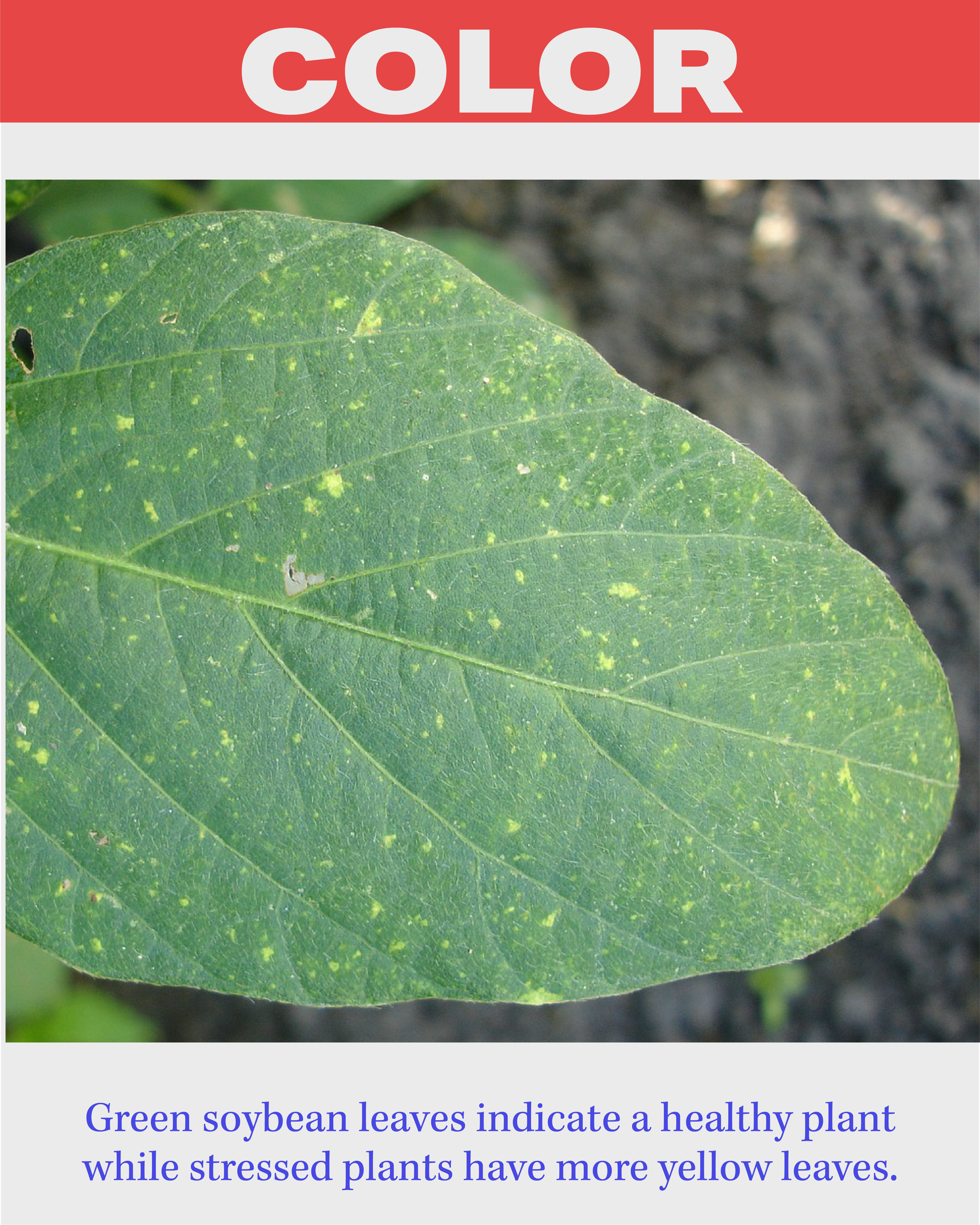
Green soybean leaves indicate a healthy plant while stresed plants have more yellow leaves.
MINI LESSON 7
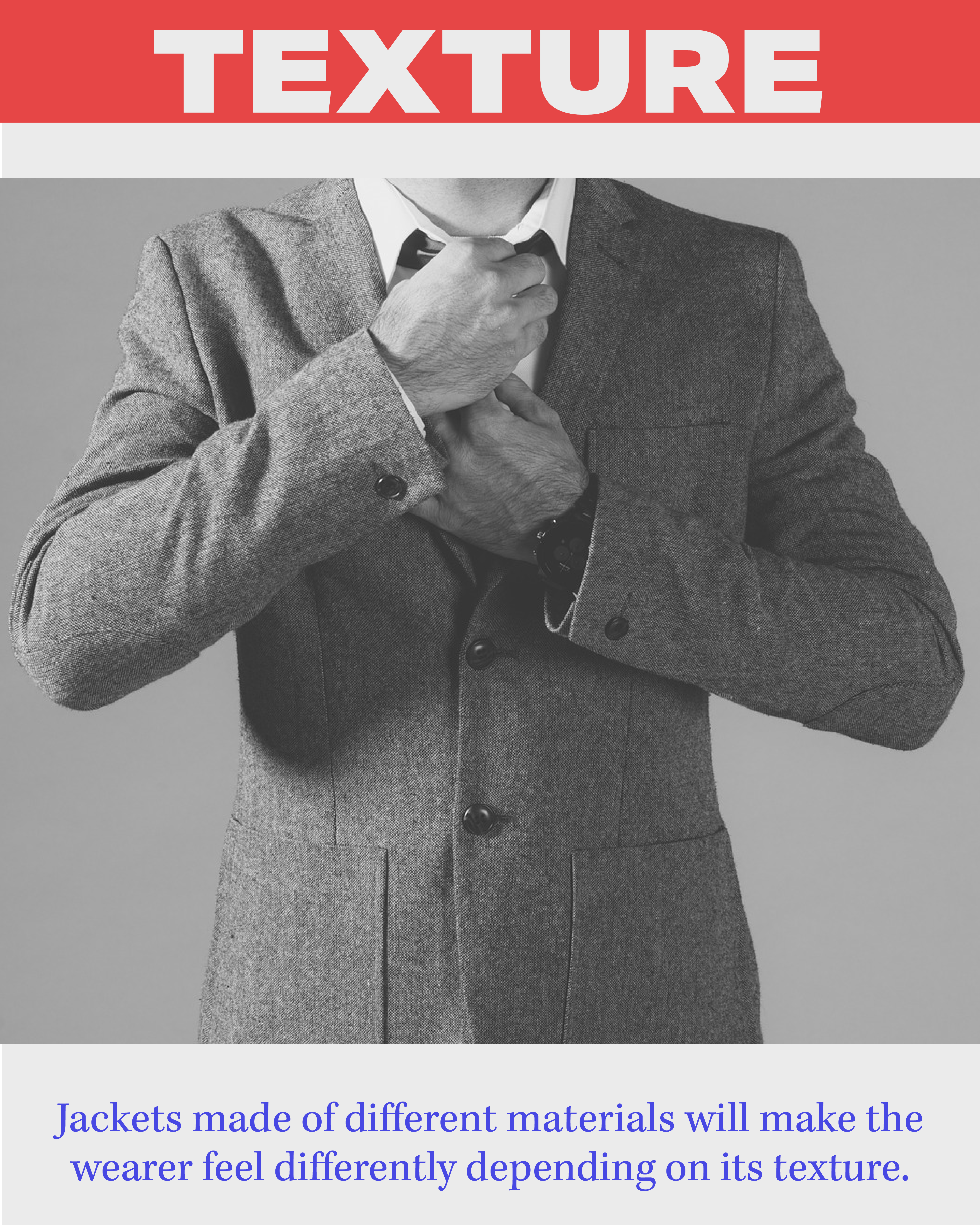
Element – Texture
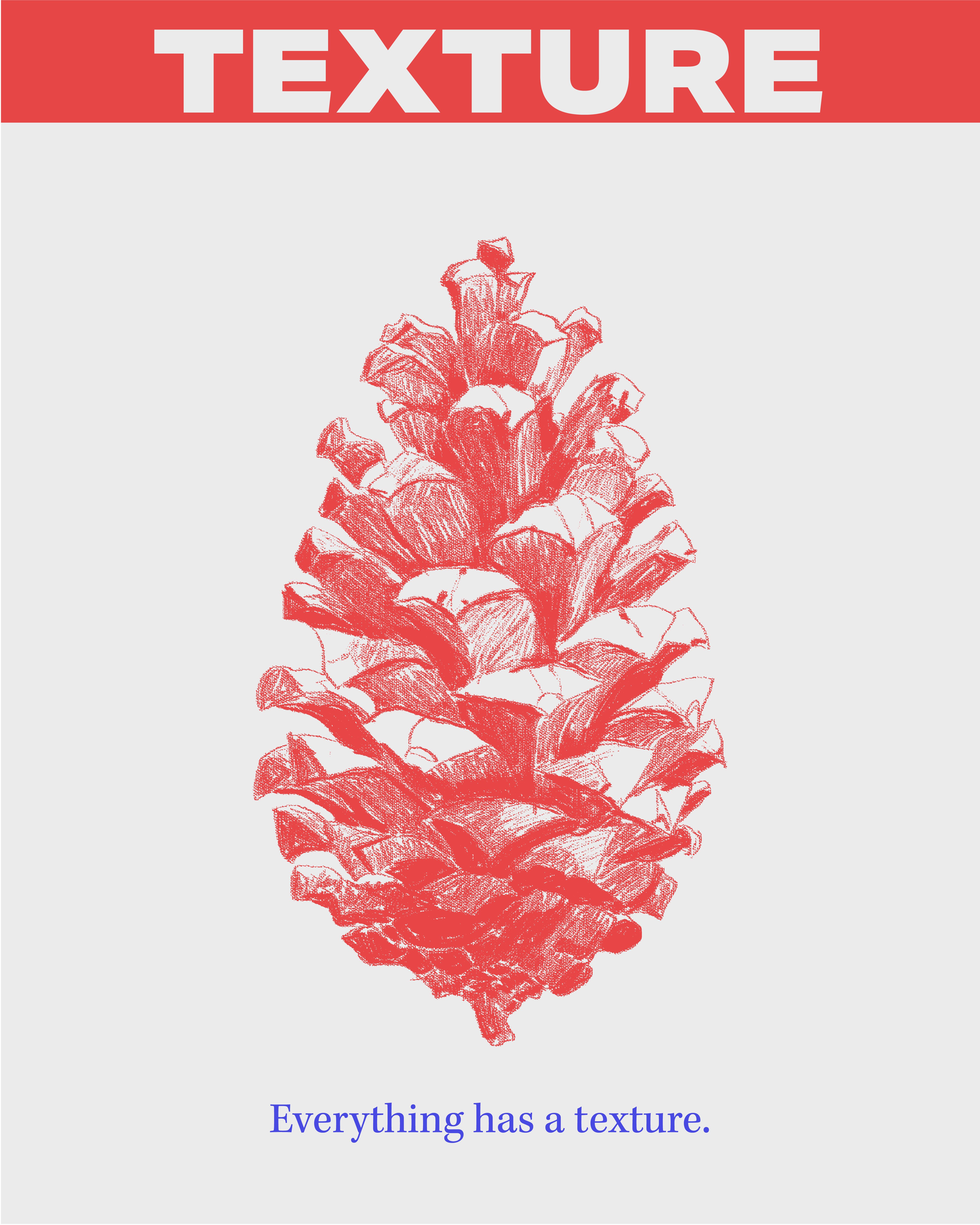
Texture is the surface quality of an area as observed by sight, sound or touch.
Everything has a texture
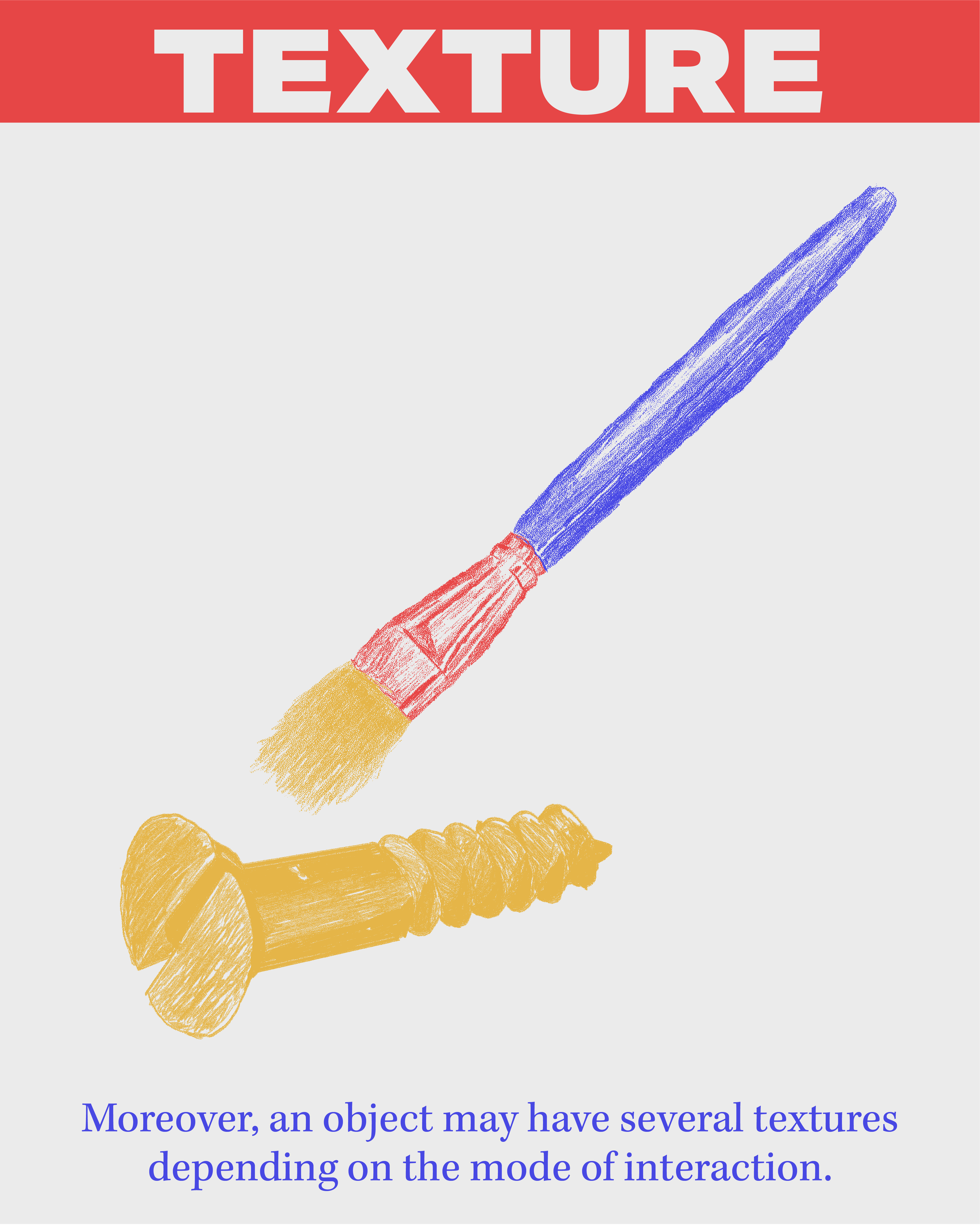
Moreover, an object may have several textures depending on hte mode of interaction.
Jackets made of different materials will make the wearer feel differently depending on its texture.
MINI LESSON 8
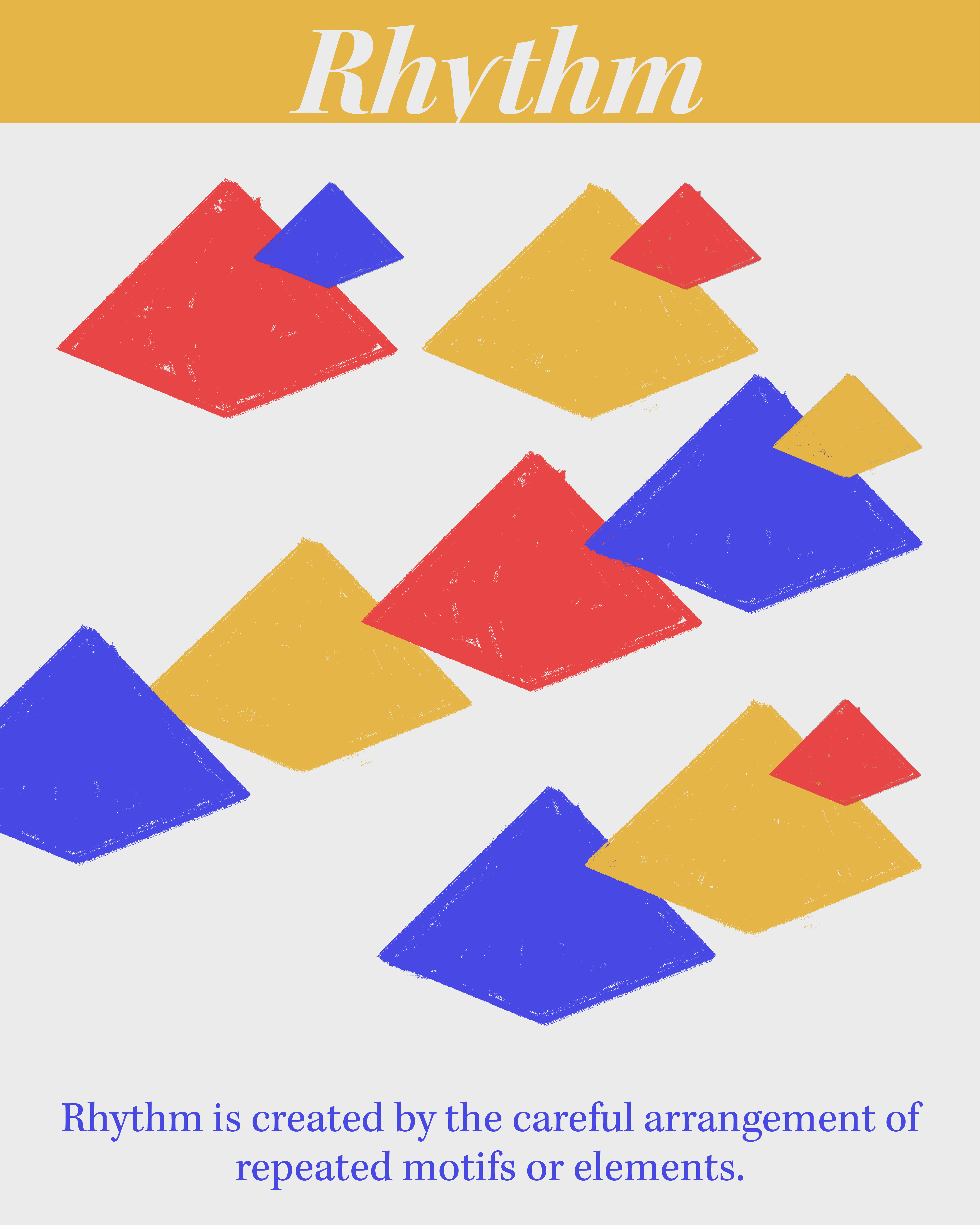
Prinicple – Rhythm
Rhythm is created by the careful arrangement of repeated motifs or elements.
Quilting relies on rhythm and repetition heavily to create visual interest.
MINI LESSON 9
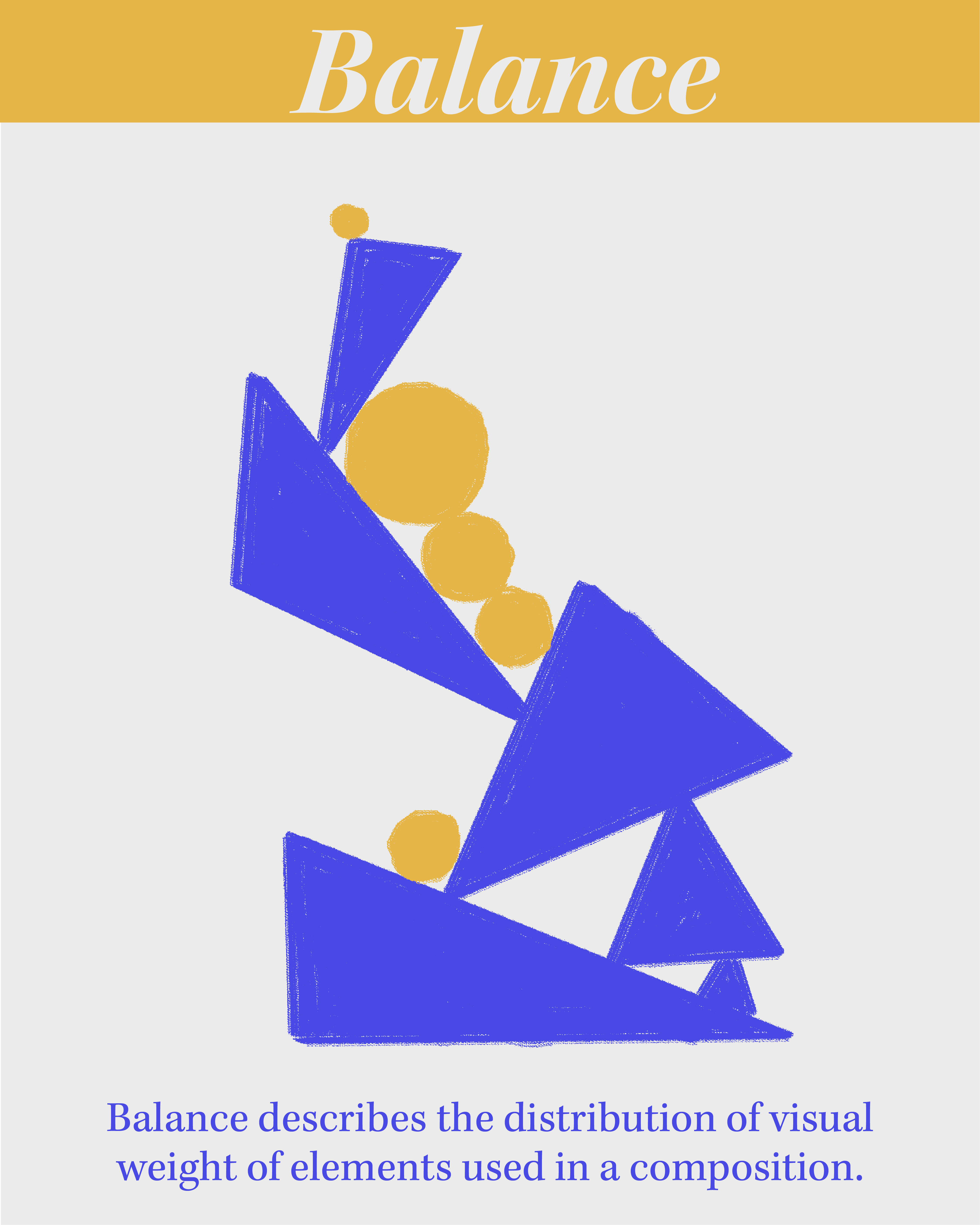
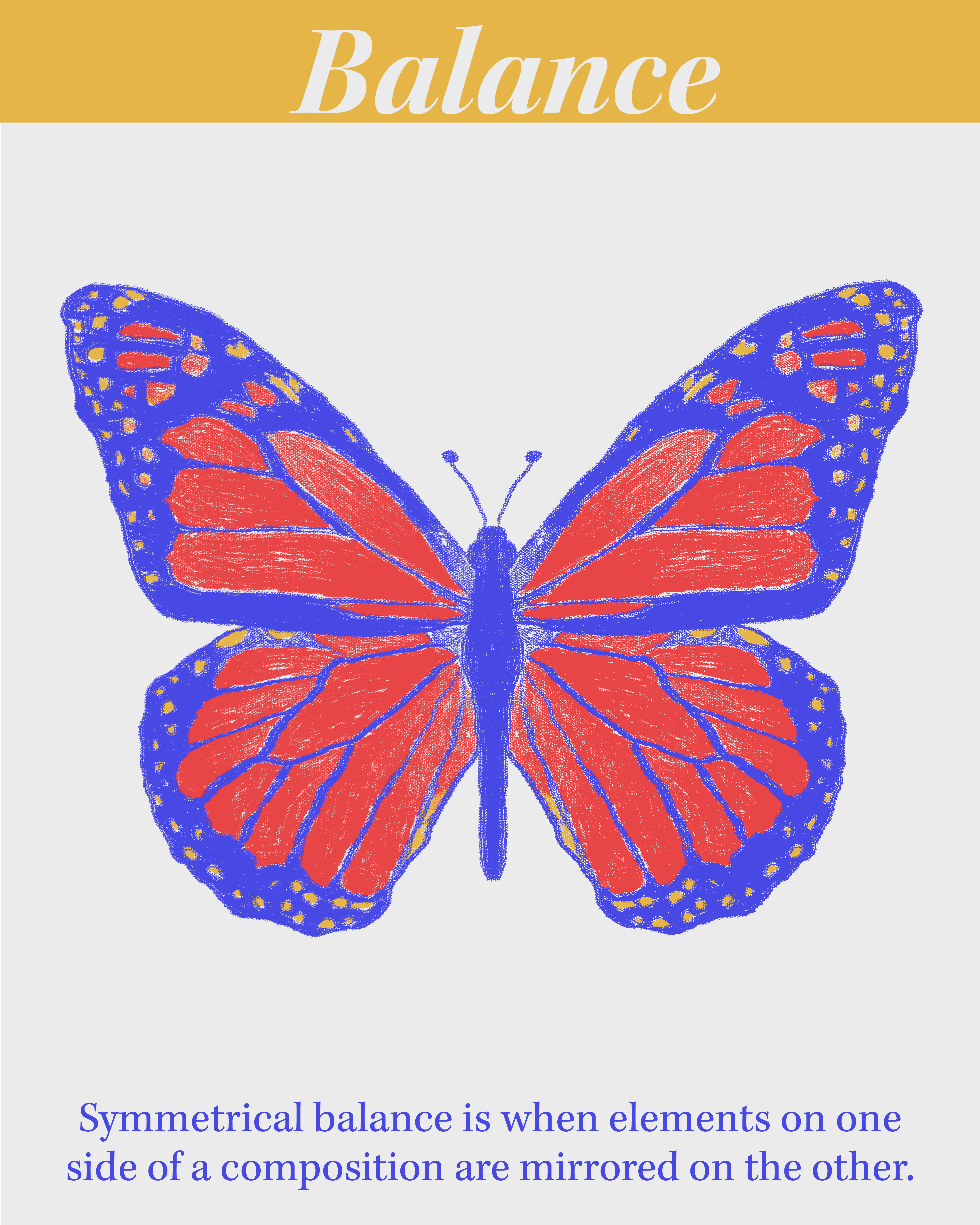
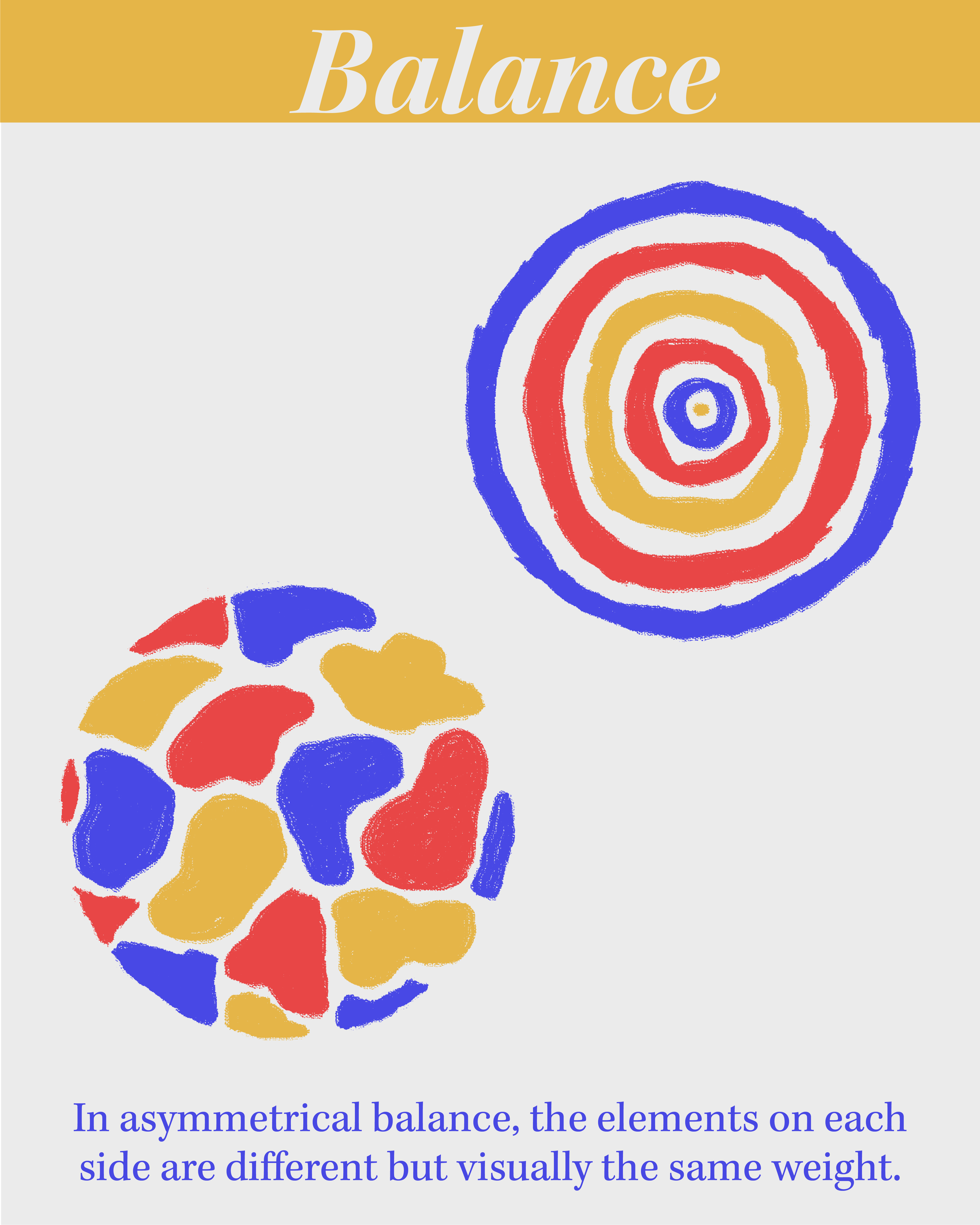
Prinicple – Balance
Balance describes the distribution of visual weight of elements used in a composition.
Visual weight is a measure of how strongly an element attracts the eye.
Symmetrical balance is when elements on one side of a composition are mirrored on the other.
In asymmetrical balance, the elements on each side are different but visually the same weight.
When a composition is radially balanced, elements are evenly distributed around a central point.
MINI LESSON 10
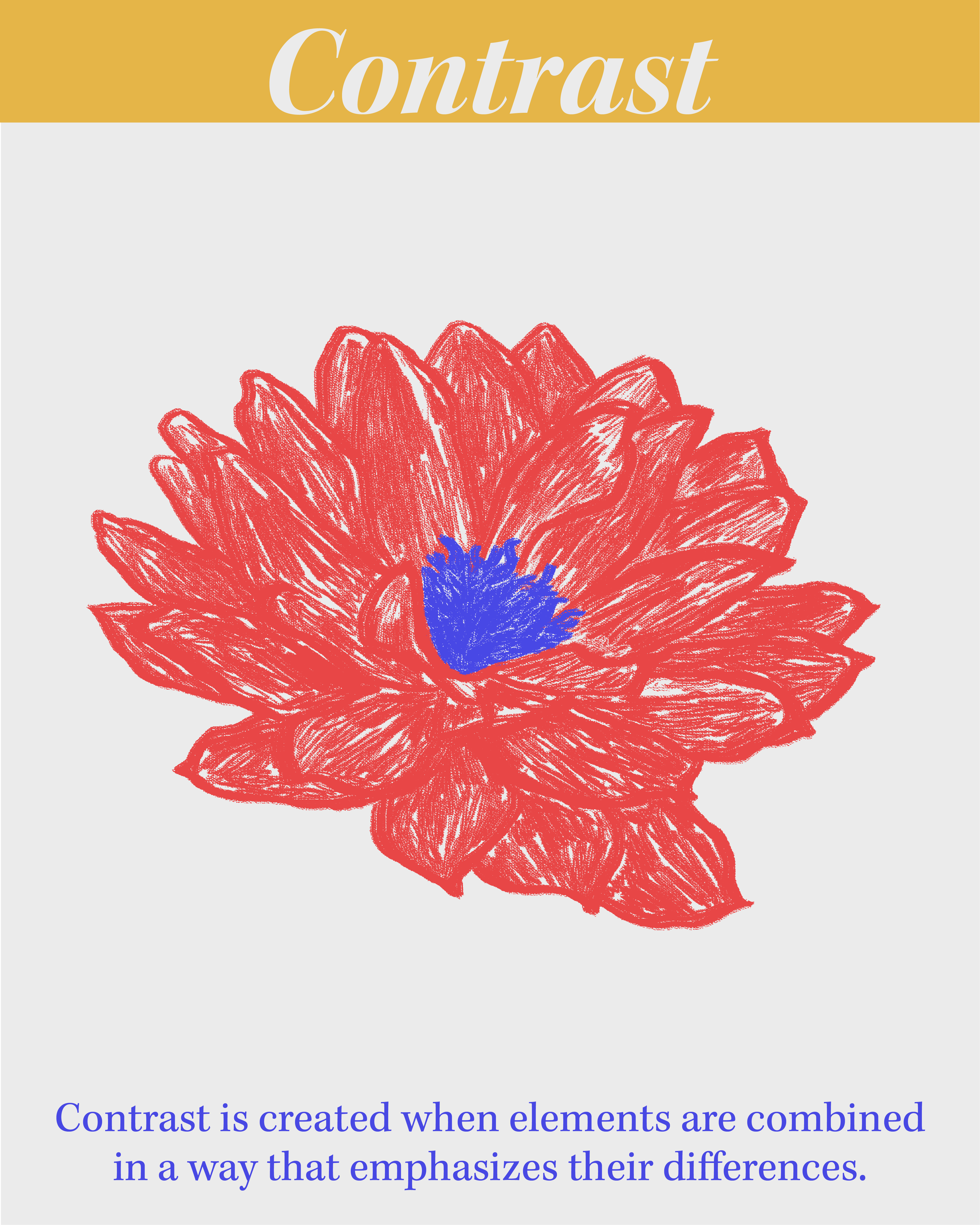
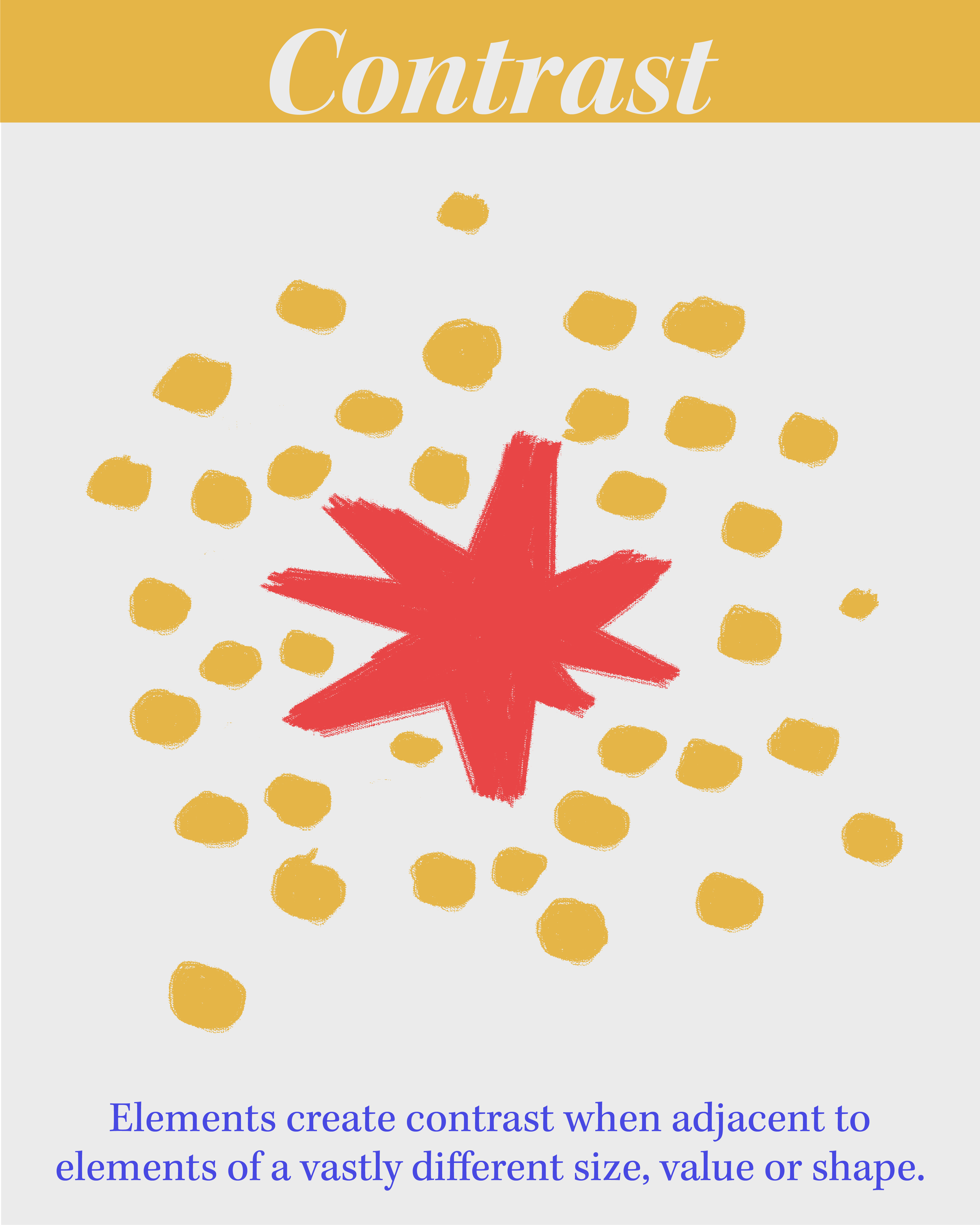
Prinicple – Contrast
Contrast is created when elements are combined in a way that emphasizes their differences.
Colors create contrast when they are adjacent to their complimentary or opposite color.
Elements create contrast when adjacent to elements of vastly different size, value or shape.
In nature, contrast can indicate distance. Mountains far away appear faded and hazy.
MINI LESSON 11
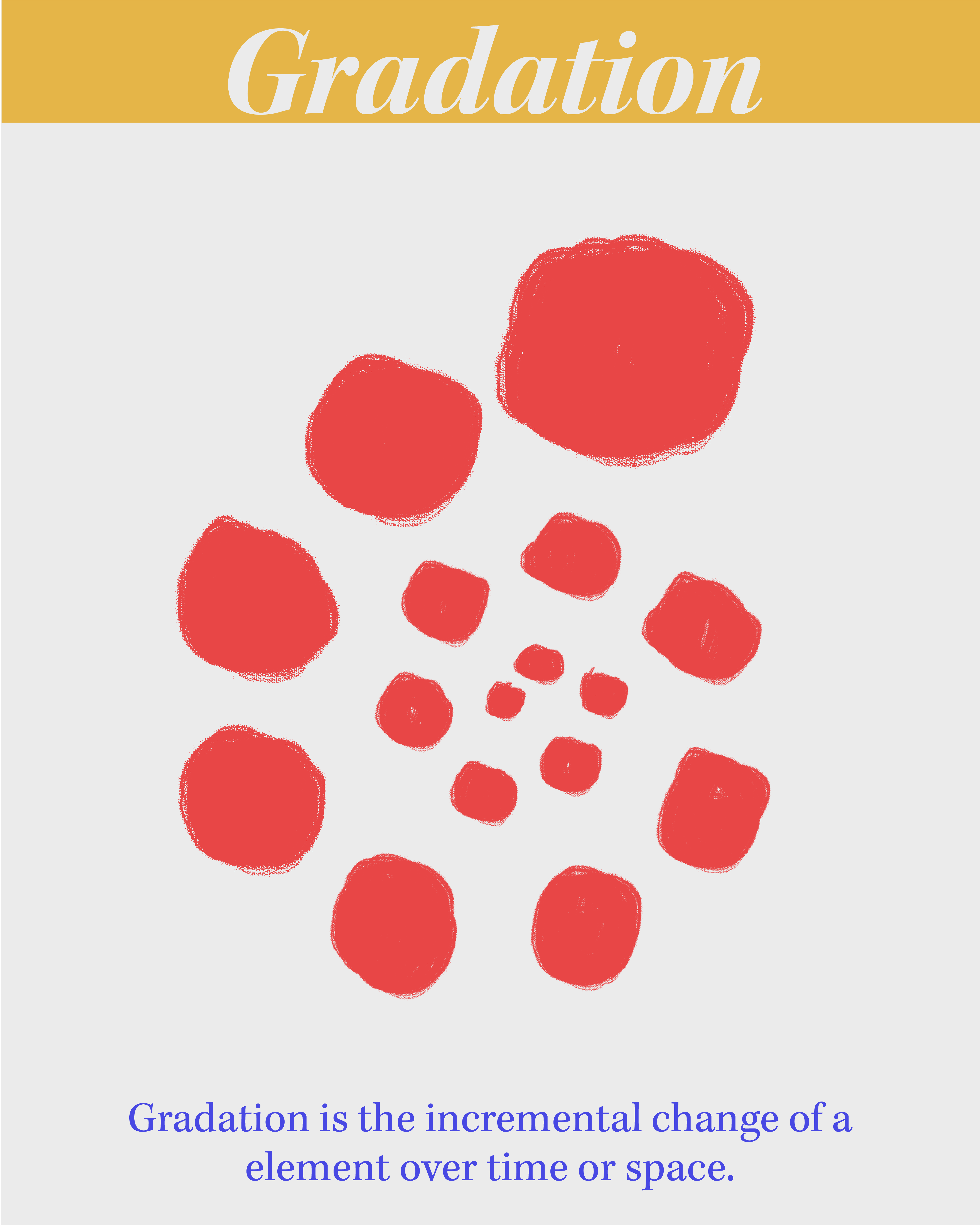
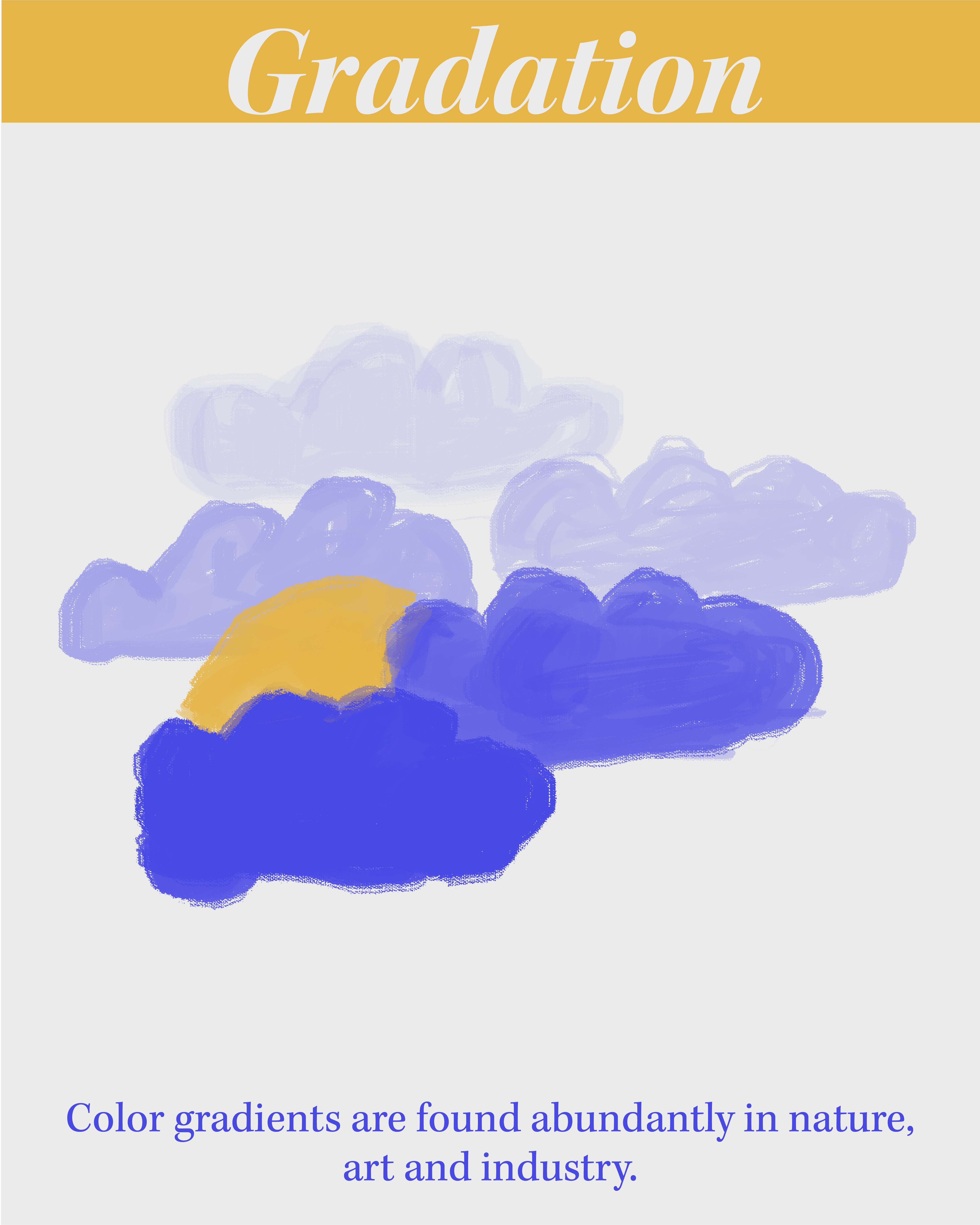
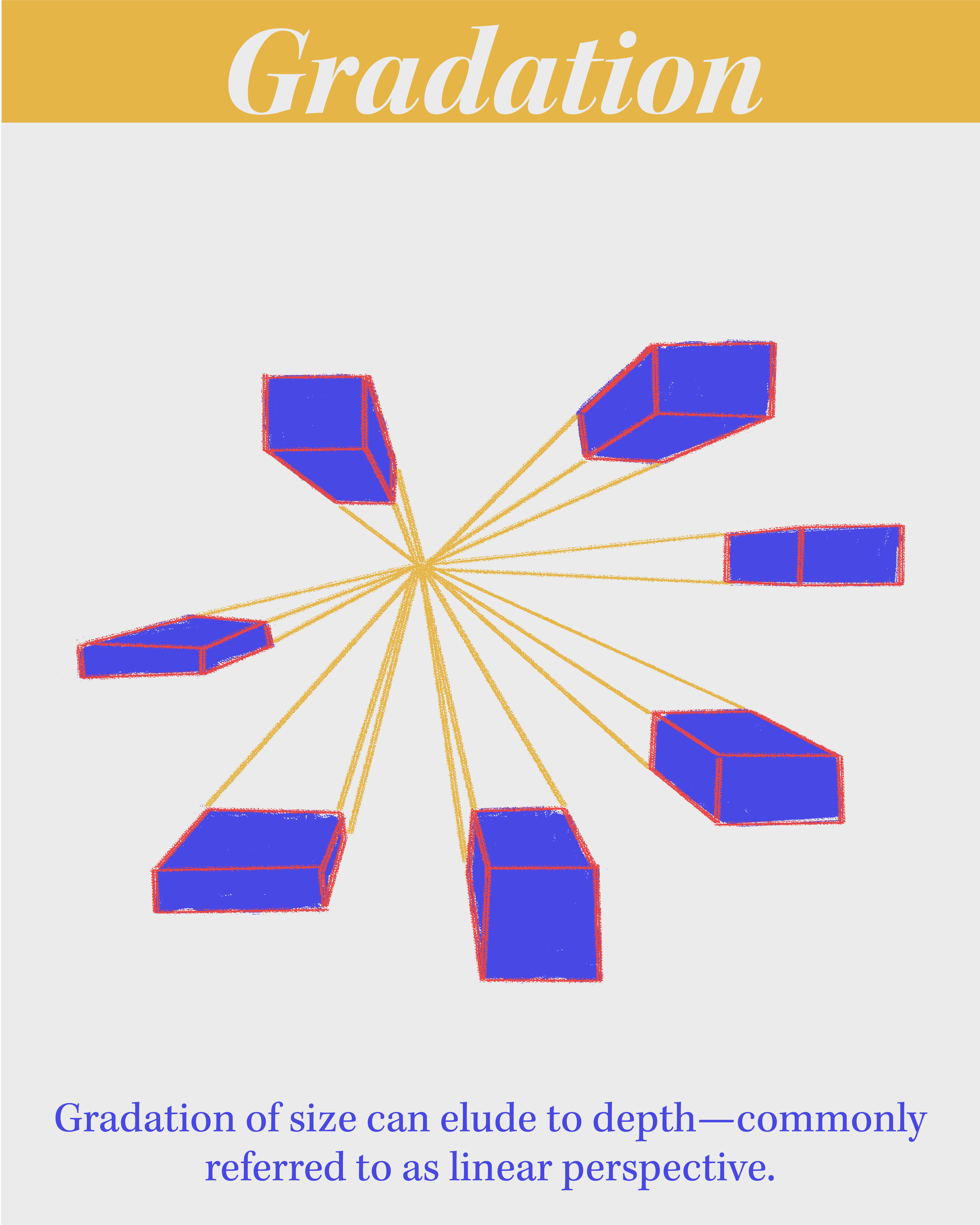
Prinicple – Gradation
Gradation is the incremental change of a element over time or space.
Color gradients are found abundantly in nature, art and industry.
Gradation of size can elude to depth - commonly referred to as linear perspective.
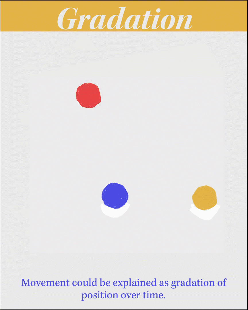
Movement could be explained as gradation of position over time.
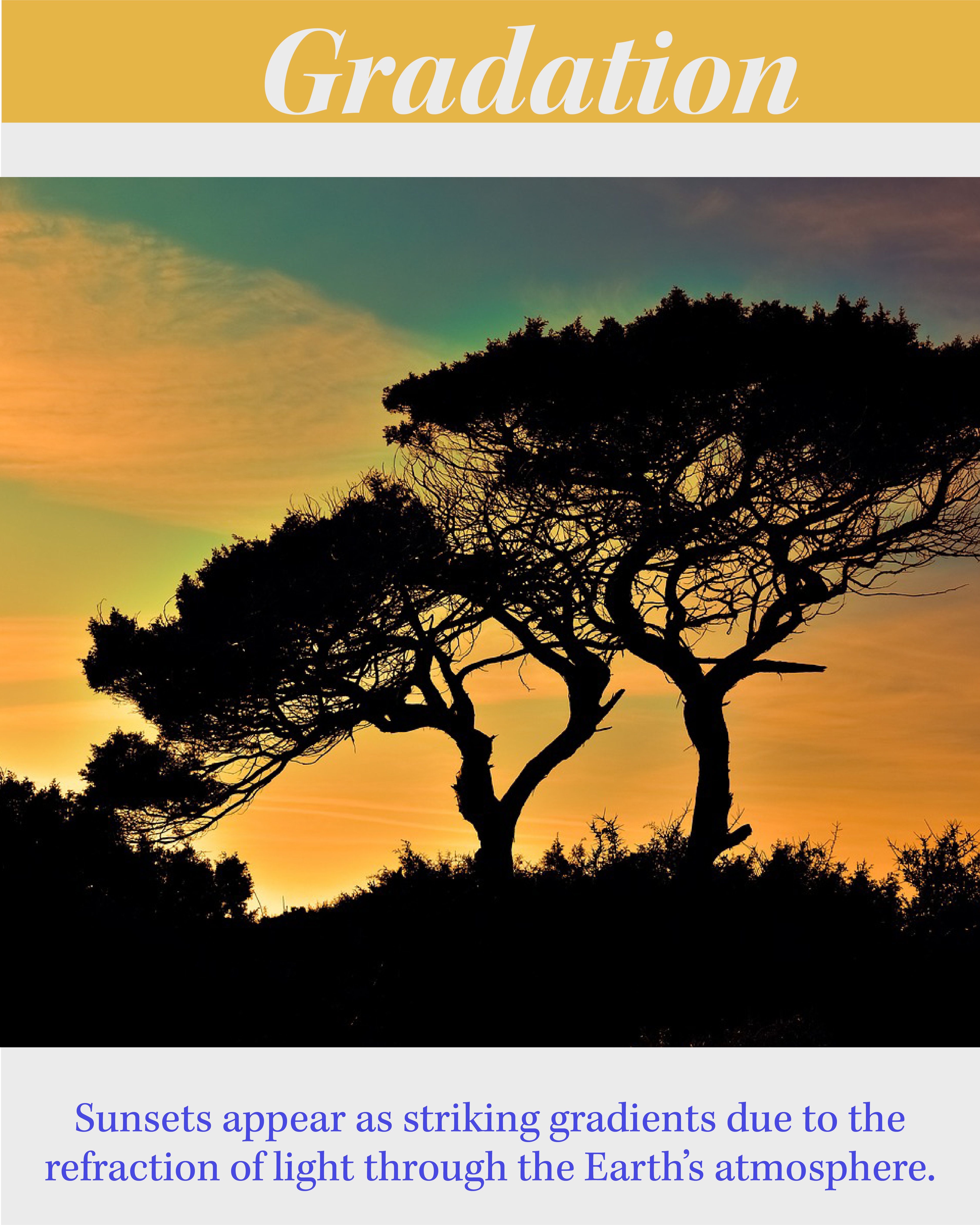
Sunsets appear as striking gradients due to the refraction of light through the Earth’s atmosphere.
MINI LESSON 12
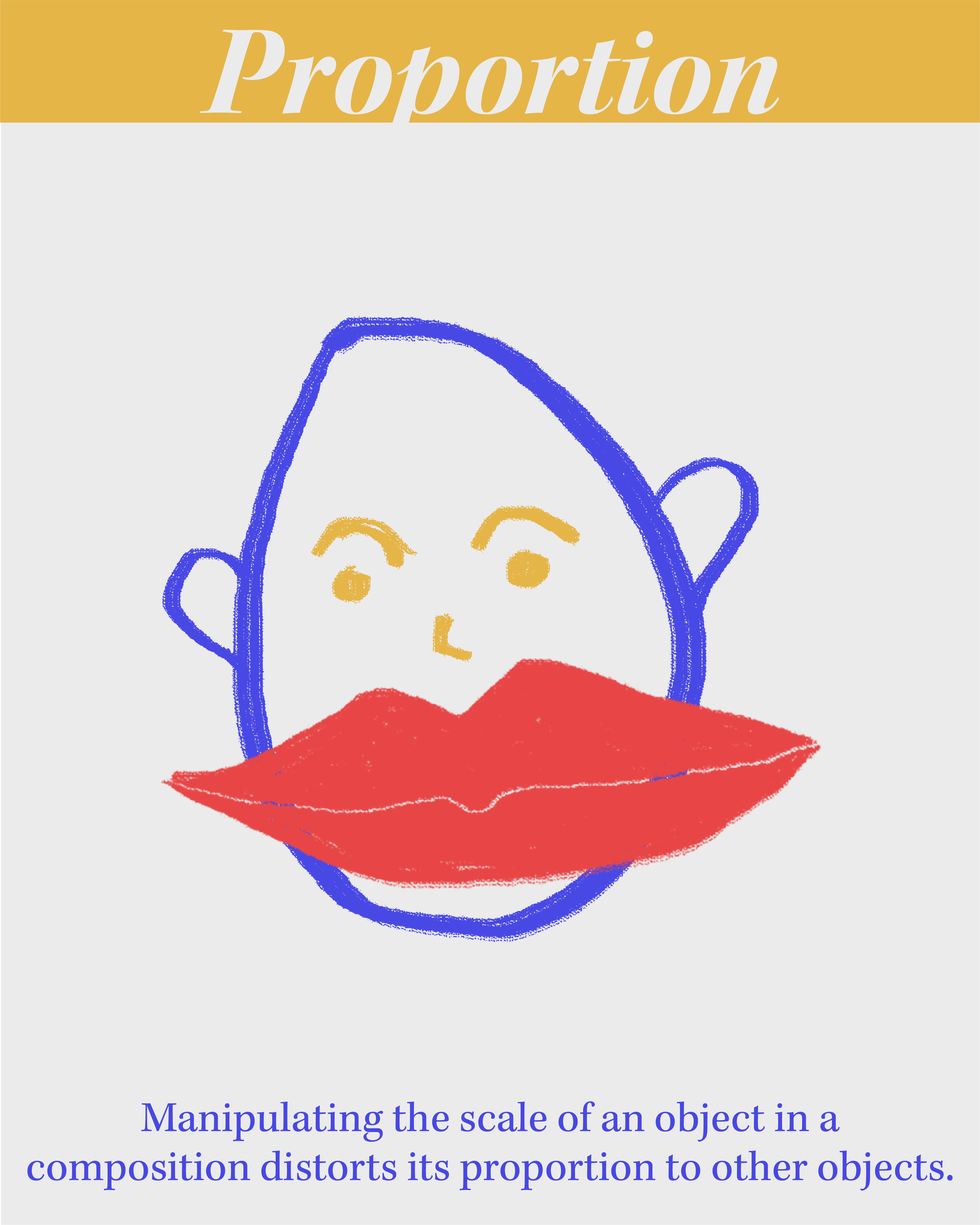
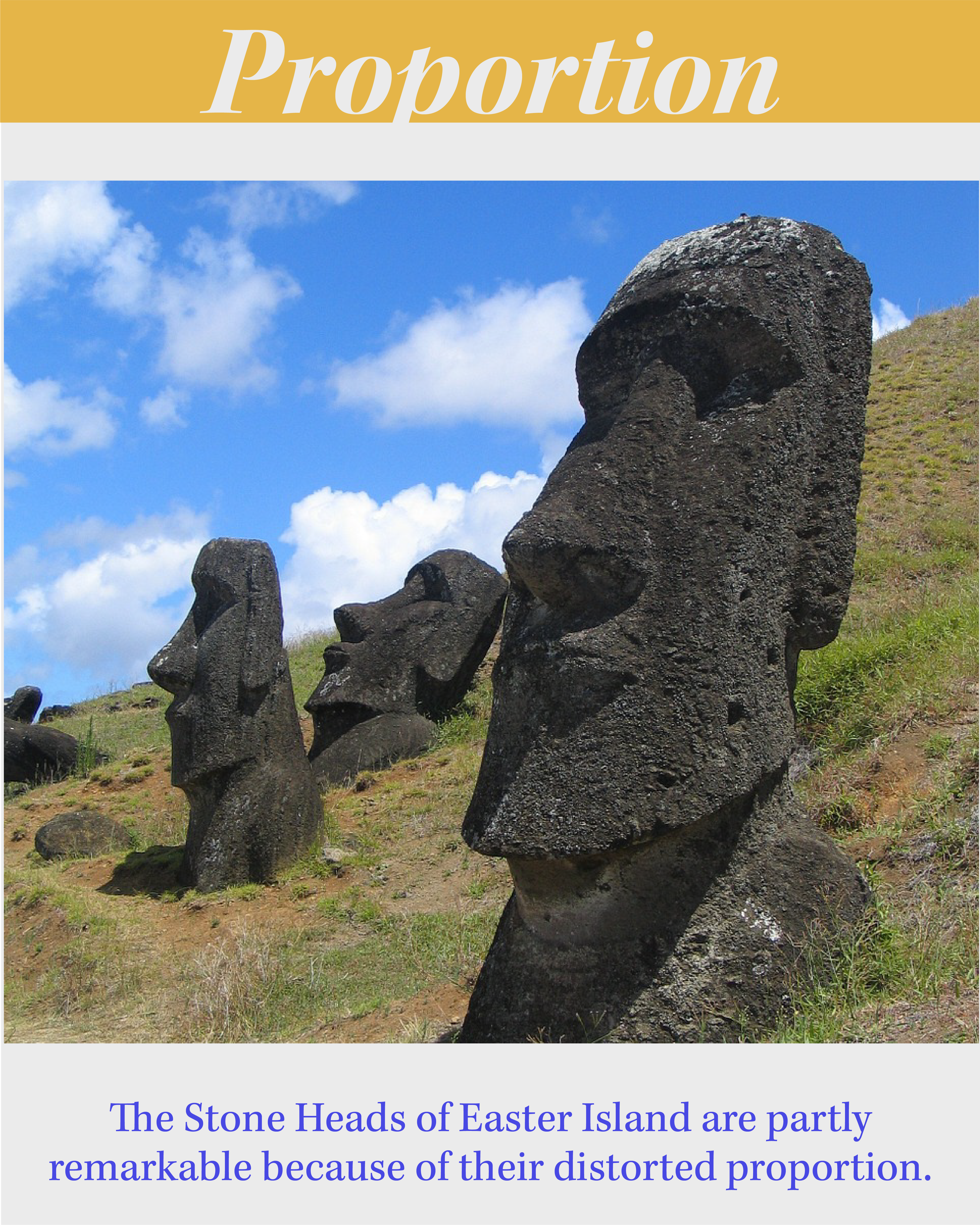
Prinicple – Proportion
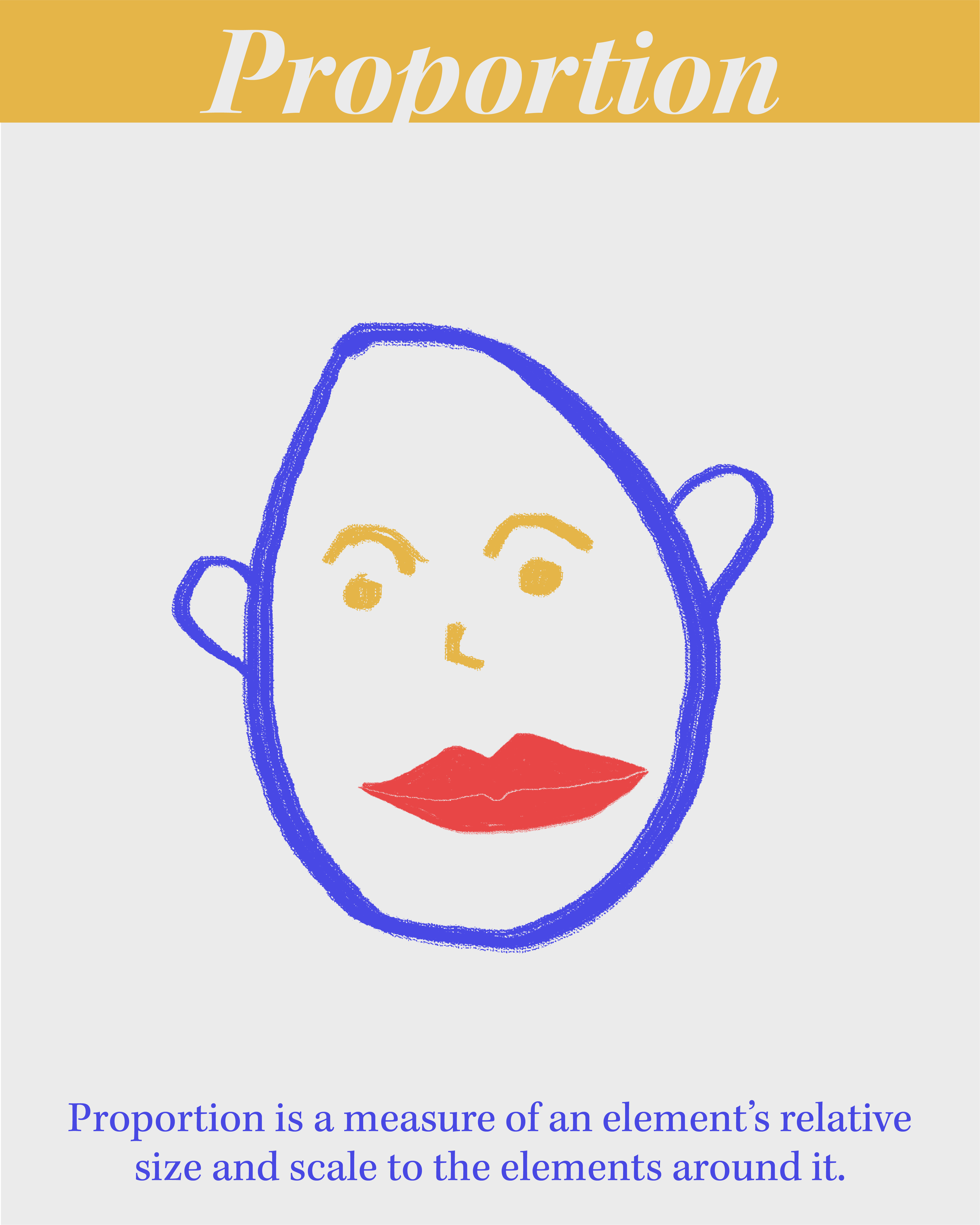
Proportion is a measure of an element’s relative size and scale to the elements around it.
Manipulating the scale of an object in a composition distorts it’s proportion to other objects.
The Stone Heads of Easter Island are partly remarkable because o ftheir distorted proportion.
MINI LESSON 13
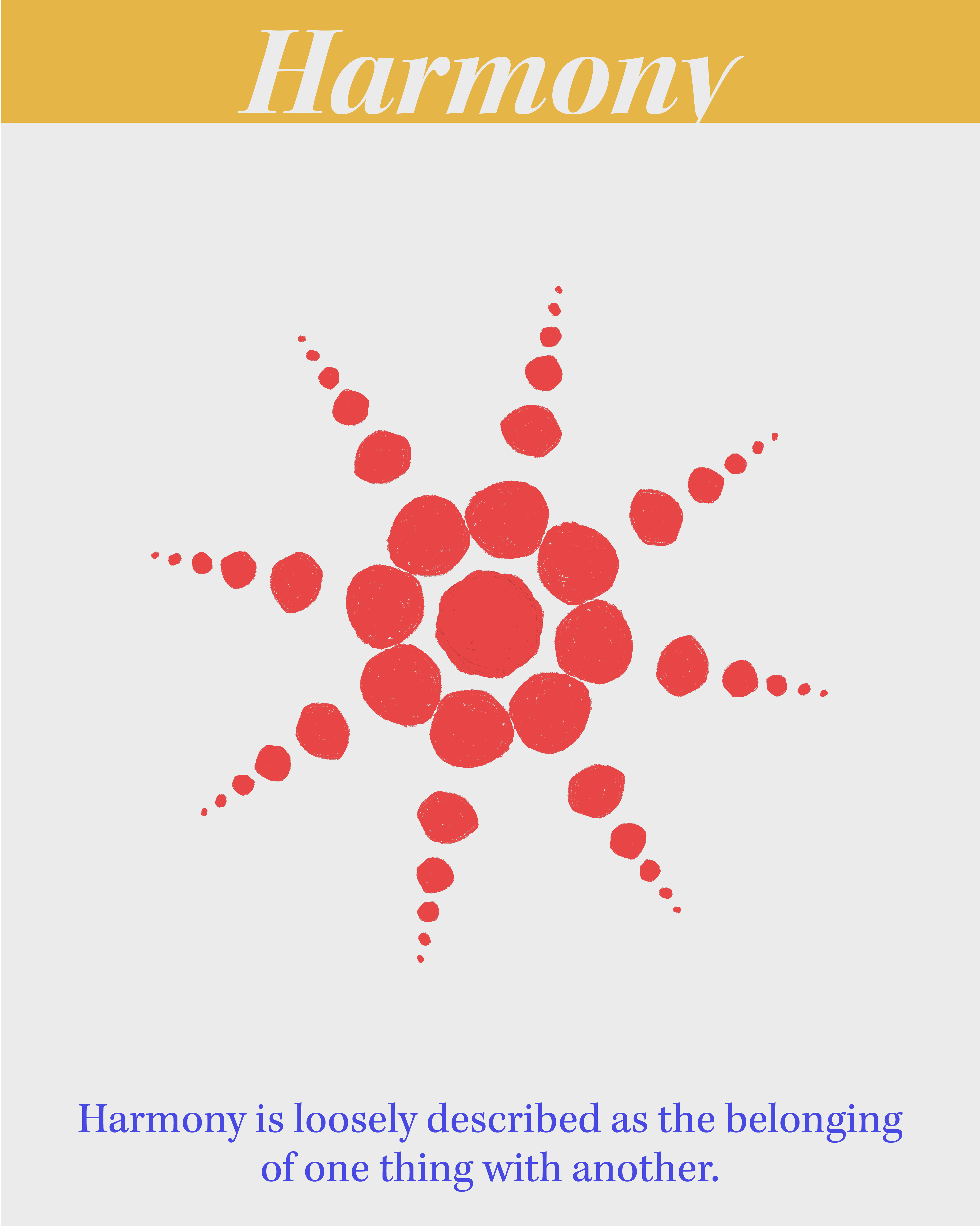
Prinicple – Harmony
Harmony is loosely described as the belonging of one thing with another.
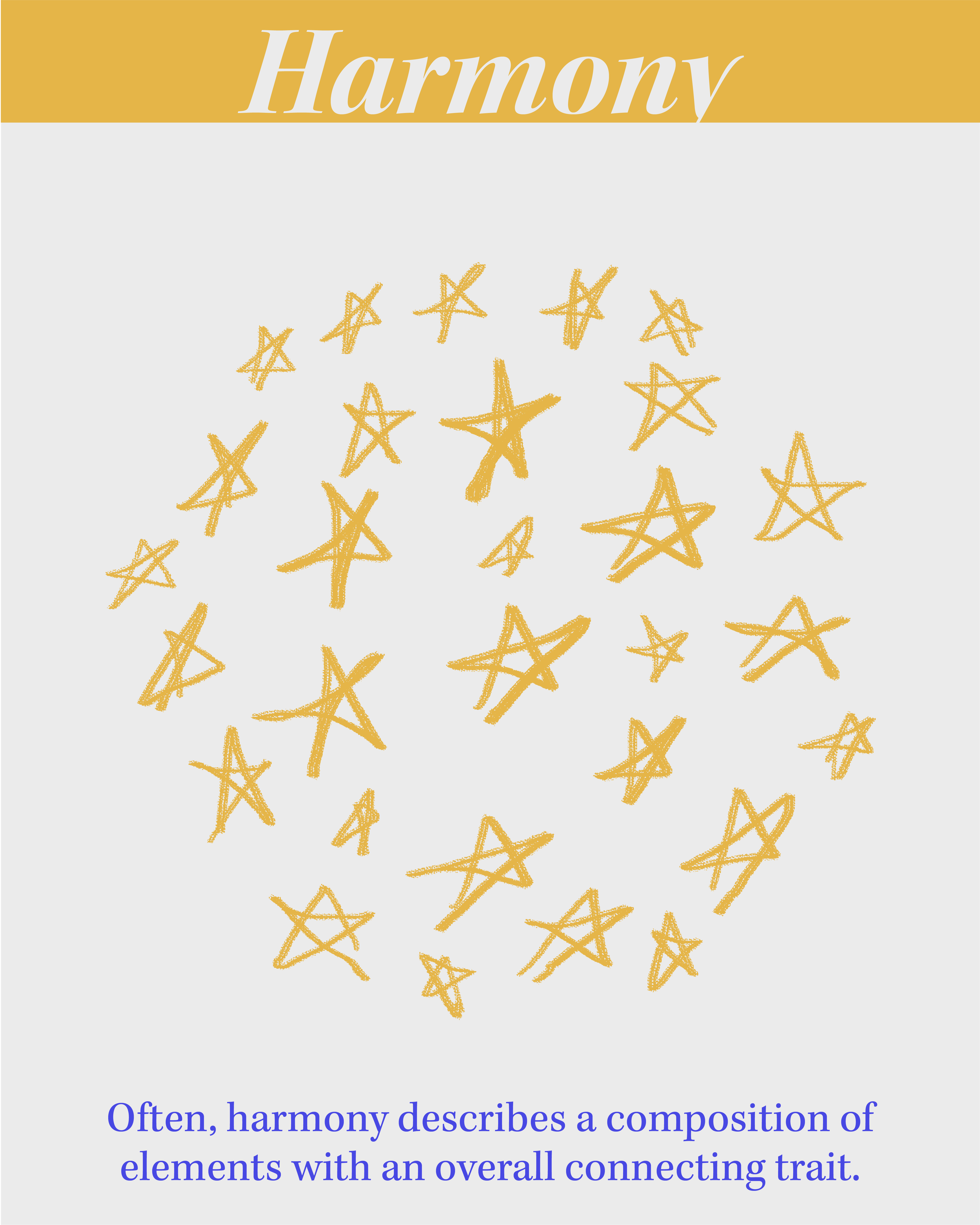
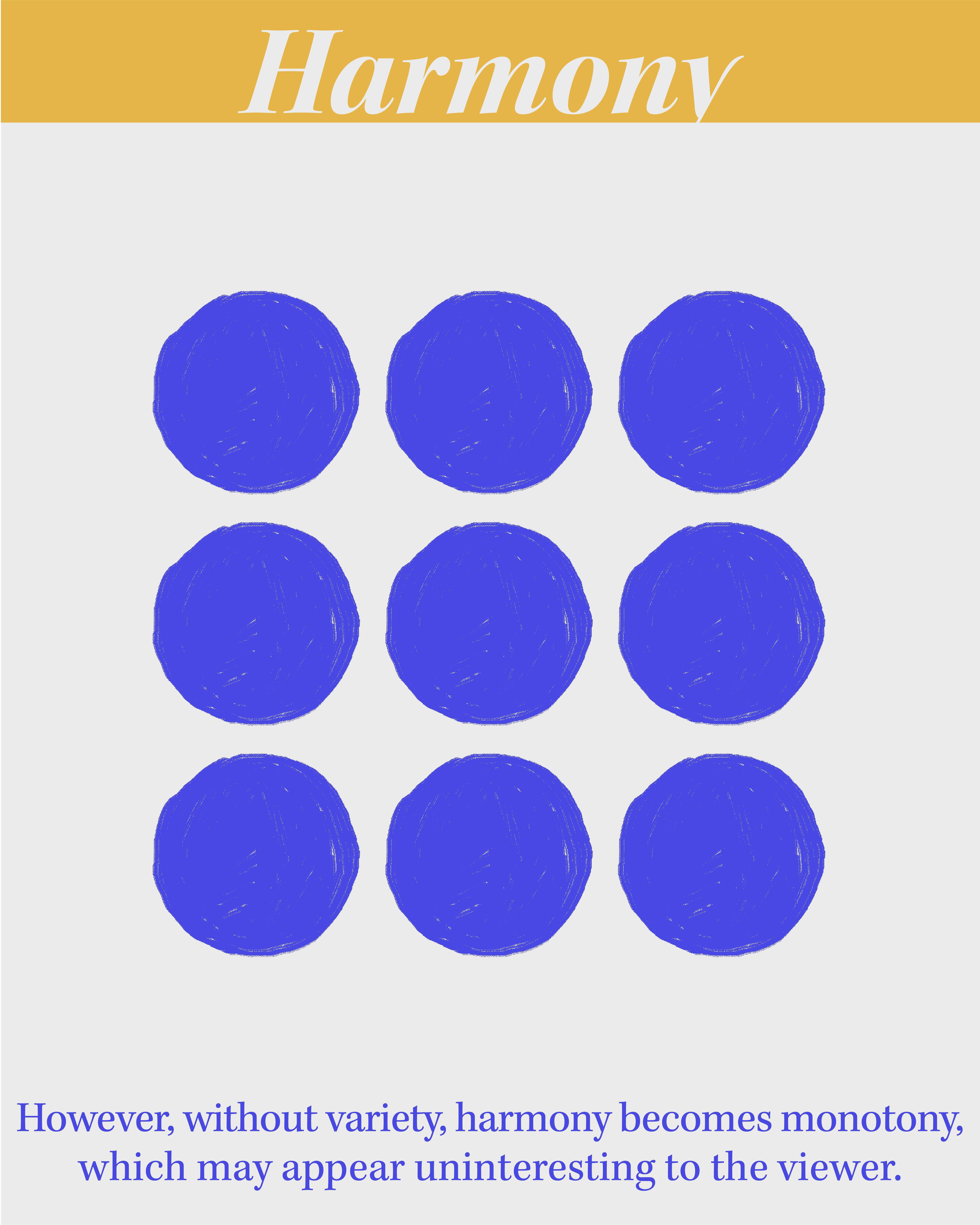
Often, harmony describes a composition of elements with an overall connecting trait.
However, without variety, harmony becomes monotony, which may appear uninteresting to the viewer.
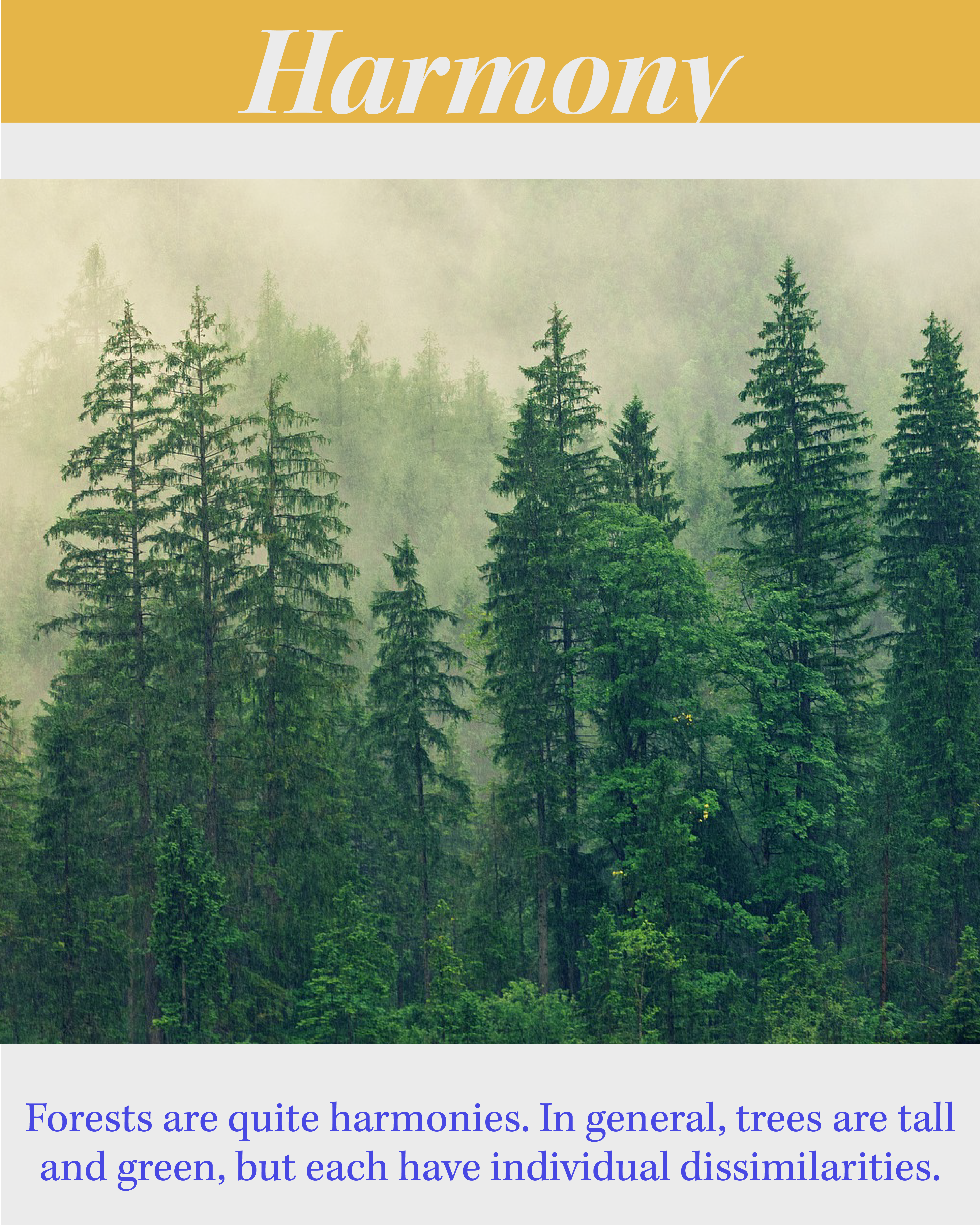
Forests are quite harmonious. In general, trees are tall and green, but each have individual dissimilarities.
MINI LESSON 14
Prinicple – Variety
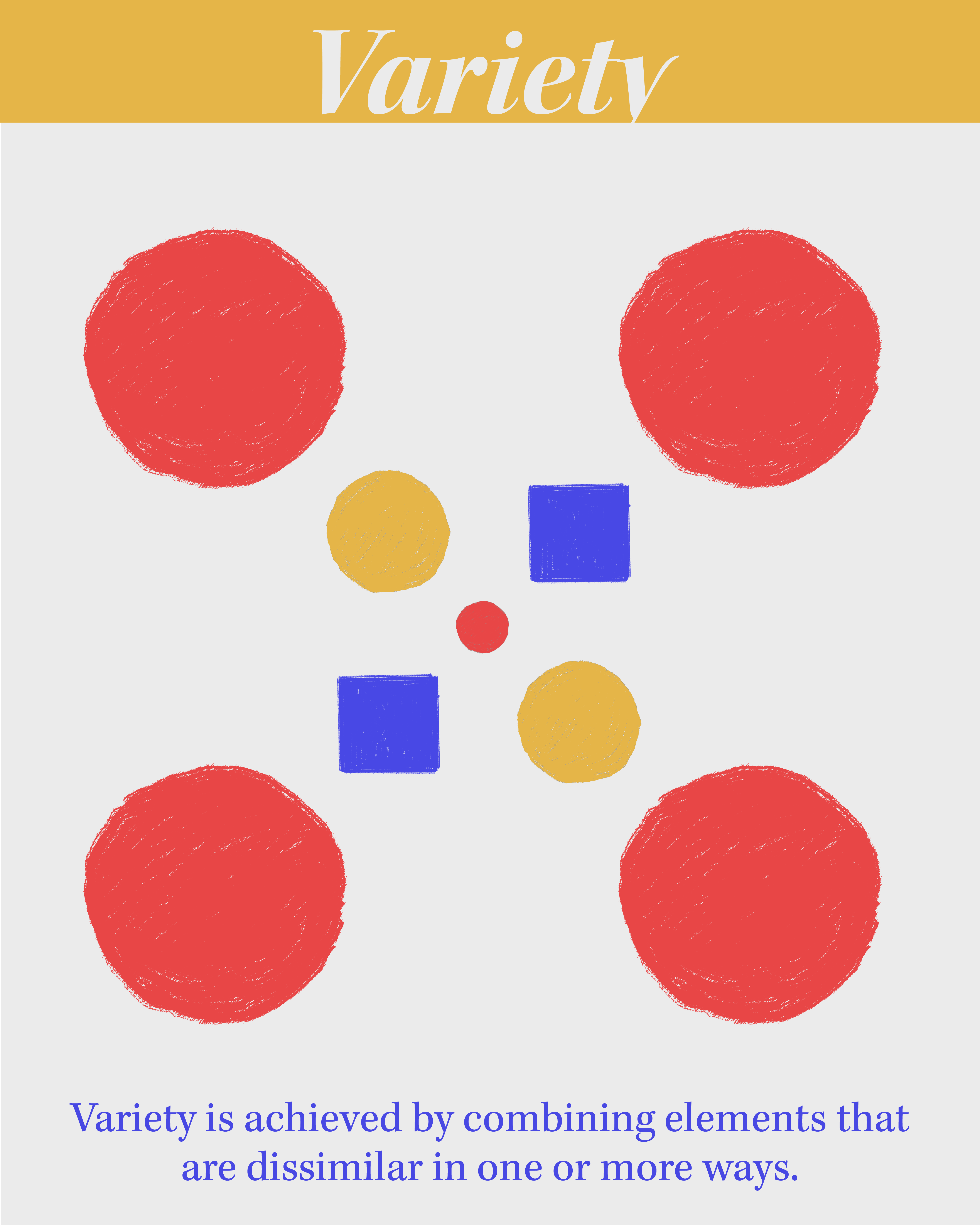
Variety is achieved by combining elements that are dissimilar in one or more ways.
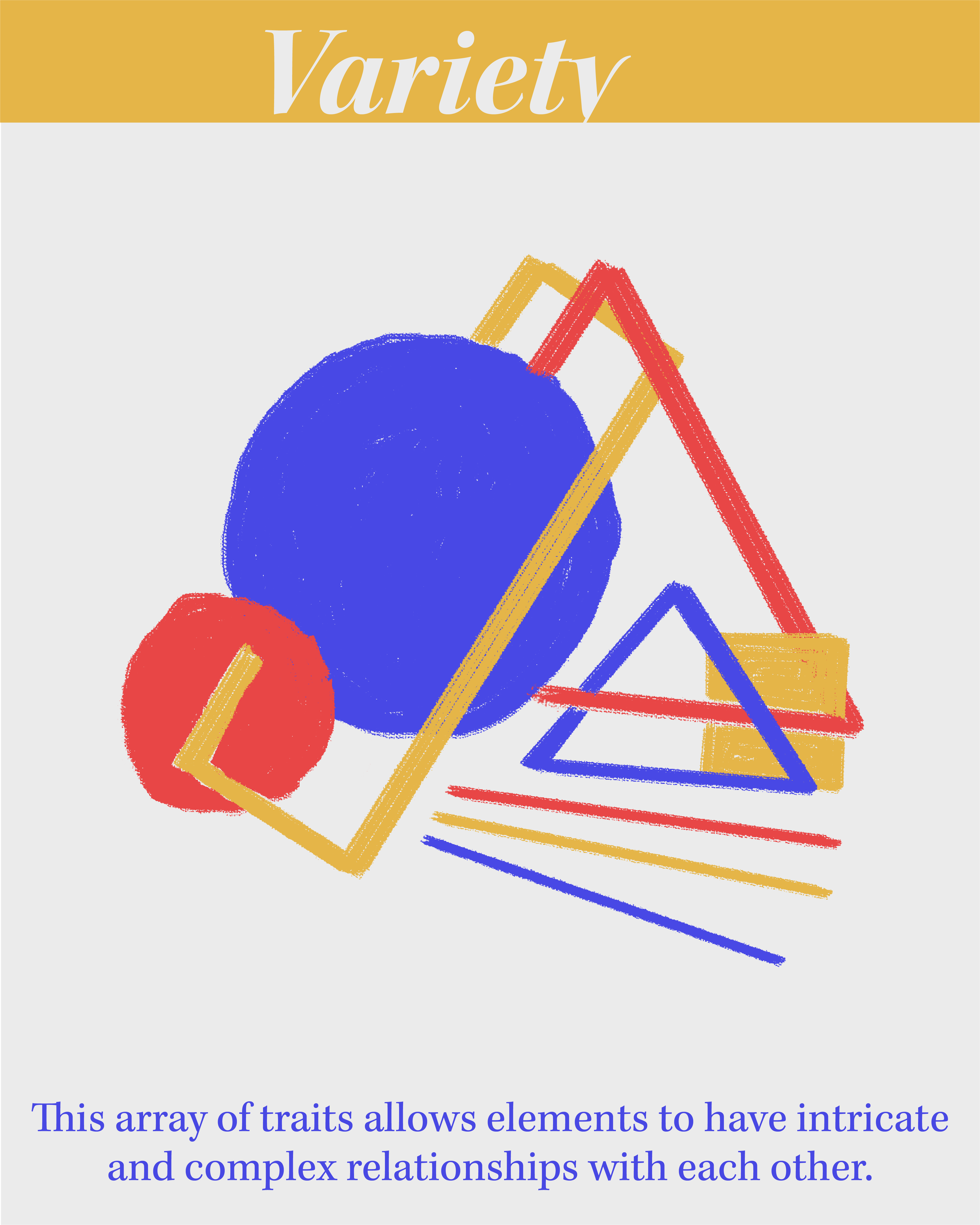
This array of traits allows elements to have intricate and complex relationships with each other.
A famous example of variety is the endless formation of unique snowflakes.
MINI LESSON 15
Prinicple – Movement
Movement is the use of design elements to direct the viewers eye around the composition.
Movement may be created as a byproduct of other design prinicples such as rhythm or gradation.
Movement can be a method of tying elements together in a composition.
In portrait photography, the subject’s eyes create a strong implied movement in the direction of their focus.